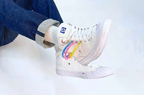
When it comes to redesigning one's logo, the results can be touch and go, which is why it's not surprising that what wasn't working a few years ago for this tech logo is now perfect for today. HP has unearthed a redesign project from 2011 and gone full steam ahead with it. Brilliant in its simplicity, it's hard to see why this tech logo was neglected even five years ago.
The new tech logo is made up of only four minimalist slashes that cleverly for the "HP" wordmark. Originally created by Moving Brands, the updated logo is being used for another branch of the company, which is happy to embrace the edgier look. The Verge writes, "[E]ven though the Spectre 13 is in a brand new, cutting-edge device, its logo, at least, is the product of many years of deliberation."
Key Themes Behind This Trend
- Minimalist Logos
- Tech companies may explore the use of minimalist logos to update their branding.
- Revisiting Past Designs
- Tech companies may find success in revisiting and reviving past logo designs.
- Simplicity in Branding
- Tech companies may adopt simplistic branding for a more sleek and modern image.
Where This Applies
- Technology
- Technology companies may benefit from rethinking their branding strategies with modern and minimalist design options.
- Design & Advertising
- Design and advertising agencies may explore the trend of minimalist logos and offer services to help companies update their branding.
- Consumer Goods
- Consumer goods companies may benefit from simplified branding strategies and incorporate a minimalist approach to their logos and packaging.