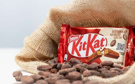
Sterling Brands has recently undertaken a rebranding initiative for Kit Kat in the United States, resulting in a refreshed, thicker logo and a new packaging design. The new logo is characterized by a more robust and dynamic appearance, with the same letters designed to evoke the sensation of a crisp snap when broken. This redesign aims to celebrate Kit Kat’s distinctive “crispy, creamy taste” while infusing the brand with the energetic vibe associated with its iconic "break". The updated logo maintains a balance between contemporary appeal and brand heritage, ensuring it remains recognizable to long-time consumers while attracting new ones.
The rebranding effort by Sterling Brands also incorporates a retro-modern aesthetic, aligning with current design trends. This approach ensures that Kit Kat’s visual identity feels both timeless and contemporary. The new packaging and logo are intended to enhance the product’s shelf presence, making it more noticeable and appealing to consumers. Overall, the refreshed design reflects a strategic effort to rejuvenate the brand’s image and reinforce its market position.
Image Credit: Sterling Brands
Why This Trend Is Growing
- Retro-modern Packaging
- Combining vintage elements with contemporary design, the new packaging strategy creates a unique aesthetic that stands out on the shelves.
- Brand Heritage Reinforcement
- The updated logo balances modern appeal with iconic elements to maintain familiarity while attracting new consumers.
- Dynamic Logo Design
- A more robust and dynamic logo conveys energy and movement, enhancing brand perception and consumer engagement.
Industries Being Reshaped
- Food and Beverage
- Innovative packaging and logo redesigns can significantly boost market presence and consumer interest in the competitive snack industry.
- Branding and Design
- Crafting logos that evoke sensory experiences exemplifies forward-thinking branding strategies in the design industry.
- Marketing and Advertising
- Dynamic visual rebranding efforts align with modern marketing trends, driving greater consumer interaction and loyalty.