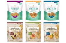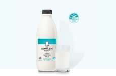
Protein powder shakes its stereotypical branding for more a more subtle appeal
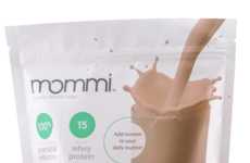
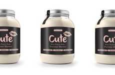
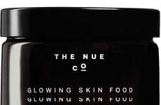
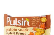
Implications - Long known for its bold and stereotypically "macho" visual branding that targeted a very specific customer, protein powder is being re-branded by many health companies in a way that reflects more contemporary design ideals, and that would appeal to a wider range of consumers. This shift highlights the high value consumers place on inclusion, which can manifest in something as simple as aesthetics.
Workshop Question - How can your brand employ design to appeal to a broader range of consumers?
Trend Themes
-
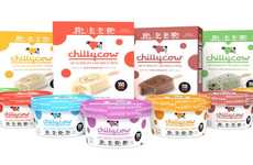
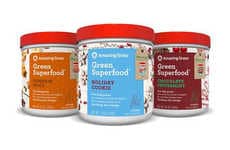
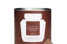
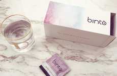
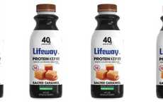
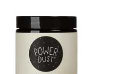
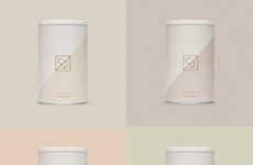
Re-branded Protein — The re-branding of protein powder reflects consumers' valuation of more inclusive visual branding and design aesthetics.
-
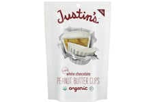
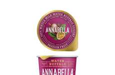
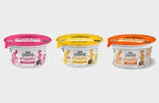
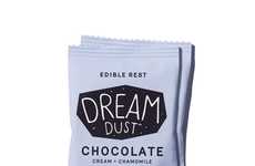
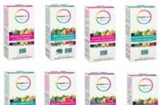
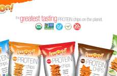
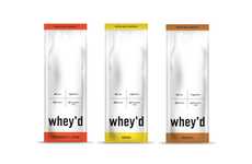
Individual Sachets — Consumers are interested in cleaner, more packaging-efficient ways to consume protein powder supplements.
-
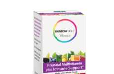
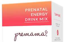
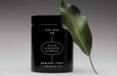
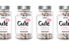
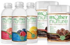
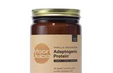
Adaptogenic and Prebiotic Powders — Companies are incorporating adaptogenic and prebiotic ingredients into protein powders to promote additional well-being benefits beyond protein intake.
Industry Implications
-
Health and Wellness — The protein powder industry is heavily influenced by trends in health and wellness as consumers prioritize nutritional ingredients and packaging transparency.
-
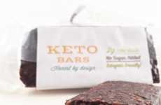
Packaging and Design — Re-branding and elegant packaging designs are an important area for disruption within the protein powder industry.
-
Functional Foods — Companies are prioritizing functional benefits such as adaptogens and prebiotic fibers in addition to protein content as consumers seek out products that improve well-being in multiple ways.