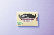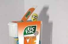
Confectionery brands experiment with spatial design in their packaging
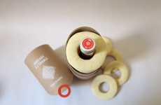
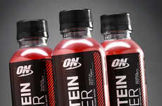
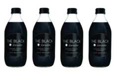
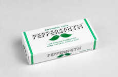
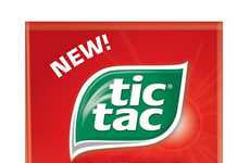
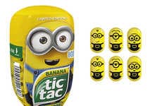
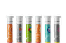
Implications - Many confectionery brands are favoring a slender or tubular aesthetic with their branding. Far from being missed on the shelves, this tactic attracts eyes through spatial differentiation. On a consumer level, this approach is favored for ease and portability. This progression speaks to the meaningful impact of shape when it comes to packaging design, both for in-store visibility and consumer mobility.
Workshop Question - Could you create a new packaging design that would ease the portability of your product?
Trend Themes
-
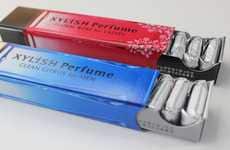
Slim and Tubular Branding — Confectionery brands are favoring a slender or tubular aesthetic with their branding for ease of portability and spatial differentiation in packaging design.
-
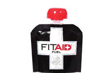
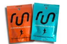
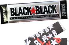
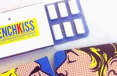
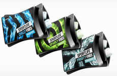
Transparent Flexible Plastic Packaging — Flexible plastic carrying case packaging for products such as chewing gum is a practical and water-resistant alternative to traditional packaging.
-
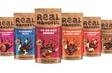
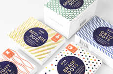
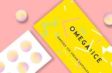
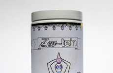
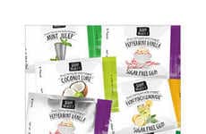
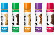
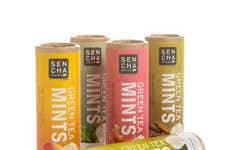
Artistic Symbol-based Labels — Visual symbol-based labels are used in supplement and snack packaging design to make products user-friendly and applicable to a wider range of consumers.
Industry Implications
-
Packaging Industry — The packaging industry has opportunities to create designs that are compact, practical, and visually appealing to consumers.
-
Food Industry — The food industry can offer consumers products that are portable, practical, and represent a food's culture and unique flavors.
-
Supplement Industry — The supplement industry has opportunities to differentiate their products with visually artistic and user-friendly packaging that highlights different nutritional benefits.