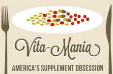


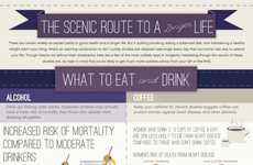
Charts and infographics on food and weight issues wake up unhealthy consumers
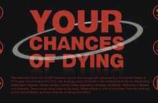
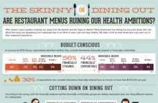
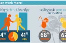
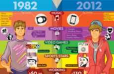
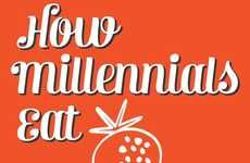
Implications - Although the direction in recent years has been toward healthier eating, many consumers -- and their children -- have continued their junkfood-ridden, zero-exercise lifestyles, leading some graphic artists to create arresting and visual charts and diagrams outlining the health issues faced by today's consumers. Ranging from food infographics to weight-tracking charts and more, these visual representations offer a way to wake up and grab the attention of people who have ignored the issue in the past.
Trend Themes
1. Health Infographics - Visual representations are being used to grab the attention of people who have ignored issues in the past.
2. Harmful Eating Habits Infographics - Infographics are being created to show the dangers of new eating habits acquired through fast-paced lifestyles.
3. Food and Diet Health Breakdown Infographics - Comprehensive infographics are being used to provide new perspectives on food and diet health trends.
Industry Implications
1. Healthcare Industry - The healthcare industry can use these trends to provide innovative strategies to prevent health issues and promote healthy living.
2. Food and Beverage Industry - The food and beverage industry can use these trends to capitalize on the growing demand for healthier options and food transparency.
3. Graphic Design Industry - The graphic design industry can use these trends to create impactful visuals that communicate complex health information in a simple and understandable manner.