

Category
Art & Design
Mood Objects
Premium packaging that's designed to stay on display after purchase.
What's Happening
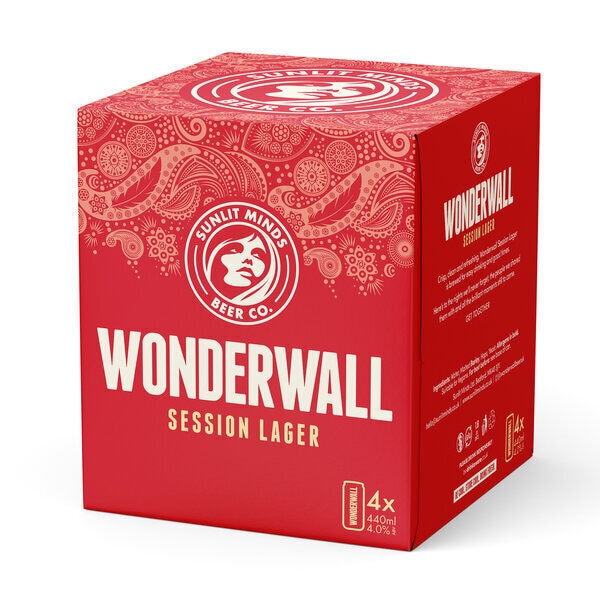
Shelf Heirlooms: Premium food and drink brands are treating containers as lasting objects rather than disposable packaging. Distinctive forms, weightier materials, and refined detailing aim to keep the package in view at home instead of disappearing after first use. Design teams are drawing on art, craft, and place-based references to give everyday packaging a more gallery-like presence.
Why It's Happening
Consumers can feel under pressure to justify premium purchases, so packaging now has to extend the sense of value beyond the product itself. A container that feels display-worthy can make the spend seem more enduring. People increasingly want packaged goods that align with their personal aesthetic, not just their taste preferences. The opportunity is to create packaging that earns its place in the home for a lingering effect that creates stronger attachments for consumers. Brands that pair memorable form with clear information and intuitive handling can turn premium design into trust, not just decoration.
Workshop question
Trajectory
Latest reading 7.3 for the week of Oct 12, 2026. Rising over the final 3 scored weeks (+1.5), −0.7 from its peak of 8.0 in the week of Oct 5, 2026. Momentum 4.6/10, persistence 7.5/10, backed by 4 research findings.
Evidence
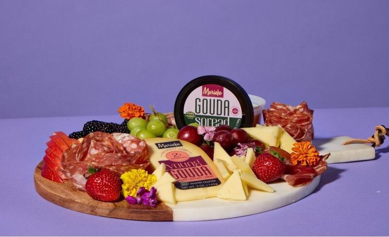
Marieke Gouda Gives Each Flavor Room to Stand Out on Shelf
Artisan dairy brands can use packaging refreshes to make nuanced flavor portfolios easier to understand without relying solely on brand familiarity.
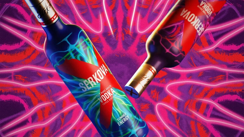
Serkova Turns Sound Waves into Bottle Graphics
Premium spirits brands are using expressive packaging systems to refresh consumer interest and build cultural association around existing formulas.
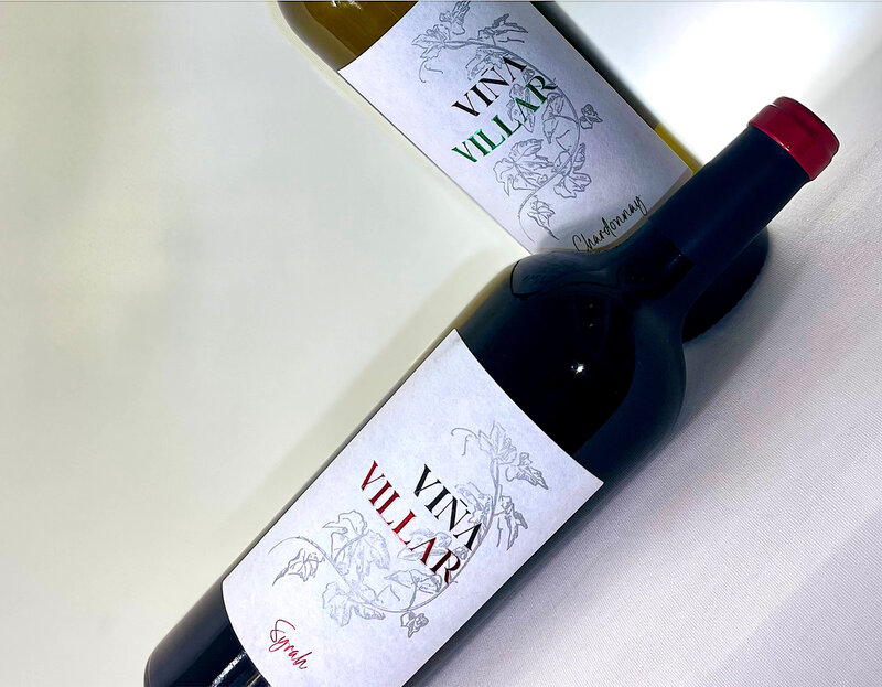
Bodegas El Villar Gives Viña Villar A Premium Redesign
Premium bottle structures and sensory label finishes are redefining how producers communicate quality in crowded retail environments.
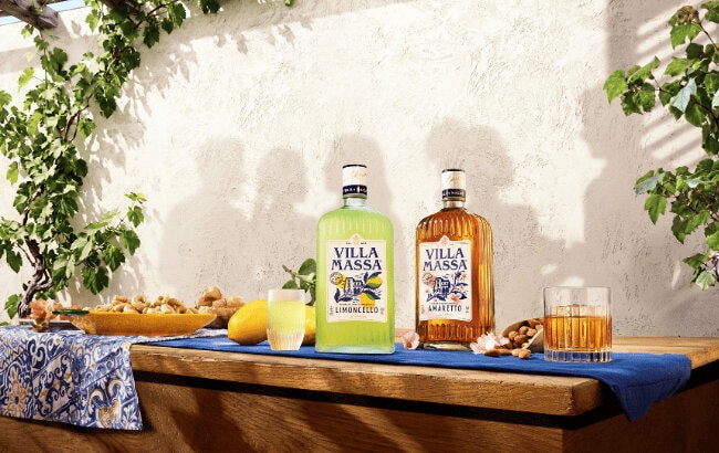
Villa Massa Redraws Limoncello and Amaretto Labels
Premium liqueur makers can benefit from packaging systems that connect flavor, geography, and authenticity in highly competitive retail settings.
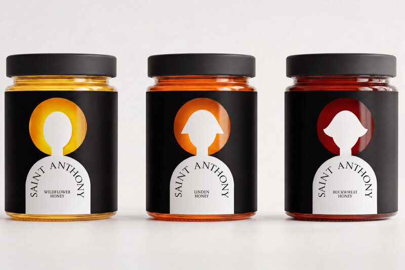
Eva Chistyakova Lets Honey Light the Saint Anthony Jars
Honey, preserves, oils, and similar categories can use ingredient color and vessel transparency to build distinctive identities around the contents.
9 Trend Hunter articles were grouped into the wider weekly cluster this trend was identified in, over 4 weeks.
 Space-Efficient Flexible PackagingAPC Introduces Its Material-Saving FlexCube Pouch
 Dual-Compartment Glass BottlesBormioli Luigi Introduces INDUE for Cosmetic Formulations
 Premium Produce PacksCantatore Fruit Company Ships Its Miranda Grapes In Six-Kilo Crates
 Lightweight Luxury BottlesMaison Violet Uses 50% Less Glass for Its Fragrances
Research
Lightweight Luxe
Consumers and retailers now expect packaging to signal responsibility, but premium beverage brands cannot afford to lose tactility, giftability, or visual polish.
That creates a design tension: packs must look expensive while weighing less and using better materials. The brands that solve it can defend premium price while staying aligned with rising sustainability scrutiny.
Front-Pack Speed
Consumers want health guidance without homework.
Front-of-pack systems matter because they compress complexity into a glance, helping people compare products under time pressure, in mobile shopping flows, or in emotionally low-bandwidth moments. Brands that fail to communicate instantly risk being invisible, even if their formulations are strong.
Tactile Access Labels
Consumers increasingly expect packaging to work for more bodies and situations, not just to look good on shelf.
Tactile cues matter because they reduce dependence on sight, making everyday routines more autonomous and dignified for users who are often excluded from standard package design.
Compliant Packaging
Packaging is no longer just a branding surface; it is becoming a compliance, usability, and trust interface.
As populations age and markets become more multilingual and digitally linked, consumers need packs that lower cognitive load and make information easier to access in multiple ways. Brands that solve for readability and navigation early can turn regulation into usability advantage.