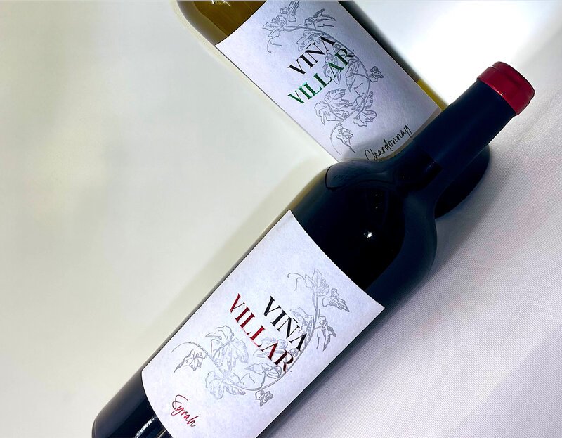
Bodegas El Villar updated its Viña Villar bottle with a cleaner, more classic label treatment built around a tapered premium Bordeaux bottle and a single delicate branch rendered in silver. The redesign shifts the visual weight to material and finish rather than illustration, so the bottle reads and handles like a higher-tier wine.
The label uses a cotton-textured paper that soaks up ink and softens flat print, leaving metallic foil and relief as the sharp details. The wine name combines three finishes—screen-printed varnish, hot foil stamping and blind embossing—within a four-process print composition that creates hierarchy through light and depth.
For drinkers this means a subtler shelf signal that reads as premium without changing brand recognition. The approach emphasizes tactile luxury and minimal ornamentation, showing how material-forward packaging can elevate perceived quality while keeping a familiar identity intact.
Image Credit: Bodegas El Villar
What's Driving This Trend
- Tactile Premiumization
- Material-rich labels with embossing, foil, and textured papers create perceived luxury through touch, opening space for brands to elevate value without major product reformulation.
- Minimalist Shelf Signals
- Subtle visual systems that rely on restraint, depth, and finish are reshaping premium cues for consumers seeking sophistication over ornate branding.
- Heritage Identity Refreshes
- Familiar brand marks paired with cleaner packaging architectures allow legacy products to feel contemporary while preserving recognition and trust.
Who This Affects Most
- Wine and Spirits
- Premium bottle structures and sensory label finishes are redefining how producers communicate quality in crowded retail environments.
- Packaging Design
- Advanced print techniques and material experimentation offer differentiated brand experiences through texture, reflectivity, and dimensional detail.
- Luxury Consumer Goods
- Understated, tactile presentation formats support a broader shift toward quiet luxury across categories where packaging reinforces perceived craftsmanship.