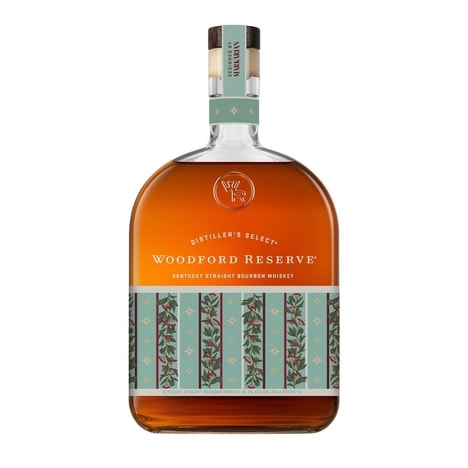
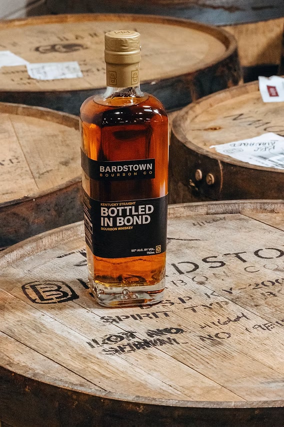
Bardstown Bourbon Co. introduced a comprehensive packaging refresh across its core portfolio, featuring a refined modernist aesthetic designed to highlight its American Whiskey lineup. The update keeps the brand’s signature bottle form while adding soft-touch substrates, heavier weighted corks and a debossed topographical map as an authenticity cue.
Design changes included bolder typography, secondary labels for shelf visibility and a clarified color system to differentiate SKUs, work overseen by Bardstown’s in-house design director with production by Eurostampa. The rollout began in early spring for Kentucky Straight Bourbon Whiskey, Bottled-in-Bond, High Wheat Bourbon and Kentucky Straight Rye, with Single Barrel and collaboration releases following later.
The redesign aims to improve on-shelf recognition and convey premium quality, while preserving the unchanged whiskey inside and supporting Bardstown’s broader national distribution push.
Image Credit: Bardstown Bourbon Co.
Why This Trend Is Growing
- Premium Tactile Packaging
- Enhanced soft-touch substrates and heavier weighted closures indicate opportunities for material innovation that redefines perceived value through multisensory packaging experiences.
- SKU Differentiation Through Color Systems
- A clarified color hierarchy and secondary labels point to the potential for modular visual systems that simplify assortment complexity and enable dynamic on-shelf storytelling.
- Authenticity Cues and Provenance Design
- Debossed topographical maps and signature bottle geometry suggest avenues for integrating physical provenance markers and anti-counterfeit features into premium branding.
Industries Being Reshaped
- Spirits and Beverage
- Packaging-led premiumization in whiskey portfolios highlights opportunities for brand-driven product segmentation and experiential premium SKUs.
- Packaging and Printing
- Collaboration with specialty producers like Eurostampa reveals scope for advanced finishing techniques and value-added substrate development within the print-finishing supply chain.
- Retail Shelf Design
- On-shelf visibility improvements and secondary labeling underscore potential for shelf-optimized design systems and in-store differentiation technologies.