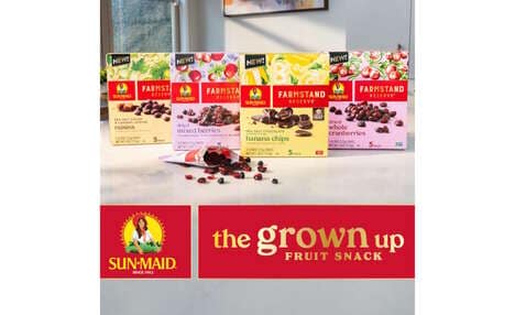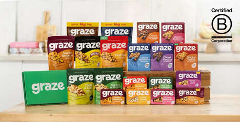
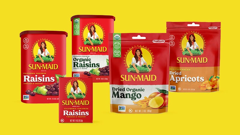
In an effort to appeal to young parents, the iconic snack brand Sun-Maid revamped its logo to embrace "modernity and simplicity." The new logo debuted with a national campaign and, like many brands attempting to reach consumers at-home amid COVID-19, Sun-Maid is also offering both recipes and activities online to help families combat homebound boredom.
The brand wanted to underscore its "authenticity, portability, wholesome ingredients" and local farmers-supporting business structure. To accomplish this, the updated logo to leverage the allure of nostalgia with the addition of the slogan 'Timeless & Trusted' while also highlighting the product's whole fruit composition. Douglas Sellers, executive creative director at global brand strategy firm Siegel+Gale, noted “The red box and yellow sun are the main semiotics here. The new simplified design pops, making the Sun-Maid logo more heroic, which amplifies the heritage in a much more simplified and modern aesthetic.”
Image Credit: Sun-Maid
Key Themes Behind This Trend
- Millennial Parent Snack Brands
- With more young parents facing stay-at-home guidelines in the wake of COVID-19, snack brands can modernize and simplify their imagery to connect with this demographic.
- Nostalgic Branding
- Brands can leverage the allure of nostalgia to reimagine and simplify their logos for a modern aesthetic that resonates with consumers.
- Digital Engagement Strategies
- Brands can offer online recipes and activities to connect with consumers and provide value beyond just their products.
Where This Applies
- Snack Industry
- Snack brands can embrace modernity and simplicity in their branding to connect with millennial parents and stay competitive in the market.
- Brand Strategy
- Brand strategy firms can work with snack companies to reimagine and simplify their logo design to emphasize authenticity and wholesome ingredients while leveraging the appeal of nostalgia.
- Online Engagement
- Brands can adopt digital engagement strategies to offer consumers more than just their products, fostering a deeper connection with their audience.