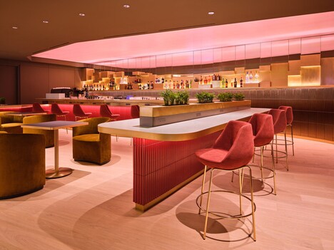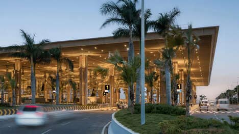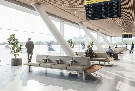
Aimed at making London's Luton Airport the destination of choice for individuals traveling in and out of the British capital, this awe-inspiring rebrand boasts a dreamy pastel-hued color scheme that feels like an escape in itself. A jarring difference from the general navy blues and grays of the average airport terminal, the Luton Airport rebrand is a massive undertaking executed expertly in this case by ico Design.
Inspired by the idea of "simplicity with a smile," the whimsical airport design is entirely Instagram appropriate and a welcome change of pace that inspires a quiet moment of reflection in the midst of hectic travel.
Using color-blocking and plenty of bright, pixel-inspired graphics, ico is able to portray Luton Airport as a beacon of hope in terms of aesthetically pleasing terminals, which will be particularly enjoyable to stare at while waiting in those long security lines.
Why This Trend Is Growing
- Pastel-hued Airport Designs
- The use of dreamy pastel colors and whimsical designs in airport terminals presents an opportunity for airports to create a visually appealing and calming experience for travelers.
- Instagram-worthy Airport Interiors
- Creating airport designs that are visually appealing and Instagram-friendly can attract social media-savvy travelers and generate organic marketing for the airport.
- Pixel-inspired Graphics in Airport Branding
- Using bright, pixel-inspired graphics in airport branding can create a unique and modern aesthetic that stands out from traditional airport designs.
Industries Being Reshaped
- Airport Design
- The airport design industry can embrace the trend of pastel-hued designs and pixel-inspired graphics to revolutionize airport terminals and create a more enjoyable travel experience.
- Tourism and Travel
- The tourism and travel industry can leverage visually appealing and Instagram-worthy airport interiors to attract tourists and enhance their overall travel experience.
- Graphic Design
- The graphic design industry can collaborate with airports to create innovative and pixel-inspired graphics that bring a fresh and unique look to airport branding.