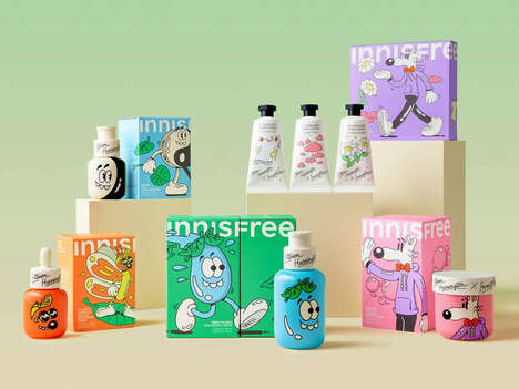
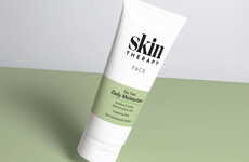

Free The Birds, a UK-based design agency specializing in health and beauty brands, has unveiled its latest branding and packaging identity for Skin Therapy, an everyday skincare brand that sells a wide range of products for Adults, Kids, and Babies.
Free The Birds tackled a rebrand of Skin Therapy's sub-brands, intending to create an overarching sense of cohesiveness between them all. As a result, all the products -- from face washes to body lotions and lip balms -- have been given a warm and wholesome look and identity.
For example, the Baby range includes playful animations of different animals but delivers them in a soft, minimalist style. Similarly, the Spa collection consists of a modest branding that features decorative swirls and turquoise hues, evoking feelings of relaxation and indulgence.
Key Themes Behind This Trend
- Cohesive Branding Packaging
- Creating a cohesive look and identity among all products in a brand line through clever packaging design and branding.
- Kid-friendly Skincare Products
- Development of skincare products like lotions, balms, and treatments that are specially designed, friendly, and suitable for children.
- Minimalist Spa Collection Branding
- Using minimalist style, decorative swirls, and soothing hues to invoke relaxation and indulgence in spa collections.
Where This Applies
- Skincare Industry
- The skincare industry can enhance their product line by using cohesive branding and packaging to entice customers with a wholesome and coherent range of products.
- Design Industry
- The design industry could take cues from the warm and minimalist approach used by Free The Birds to develop a cohesive design solution for their many clients.
- Children Products Industry
- Developing kid-friendly skincare products and treatments that are attractive, stimulating, and soothing to children could be a growth opportunity for the children’s products industry.