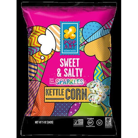

There would be absolutely no competition for recognition on the supermarket shelf if this concept for pop art packaging were to come to be. Inspired by the work of Roy Lichtenstein, a 1960s pop artist, these cartons for WOW! Chips for Girls visually scream for attention with a big pair of seductive lips on the front of each one.
Each bag of chips differs noticeably to reflect the flavors contained inside. The luscious cartoon mouth opens up to a carrot, a parsnip or a beet, and the dotted background color references the pigment of the associated vegetable. In conjunction with the bright green, pink and orange used within this pop art packaging is the bold red fill of the chunky letters to spell "WOW!" Everyone would notice these products, and target young female market would certainly be drawn in.
What's Driving This Trend
- Pop Art Packaging
- Incorporating comic-inspired designs and bold colors in packaging to make products stand out on the shelves.
- Flavor-specific Packaging
- Using packaging designs that reflect the flavors contained inside to differentiate products from competitors.
- Bold Typography
- Using bold and chunky letters to make the brand name and message stand out.
Who This Affects Most
- Snack Foods
- Introducing bold and eye-catching designs to snack food packaging to appeal to younger consumers.
- Food and Beverage Packaging
- Incorporating bold and unique designs in food and beverage packaging to differentiate products from competitors.
- Marketing and Advertising
- Creating attention-grabbing designs and messaging in marketing and advertising to target younger demographics.