Mild Whistle’s Crafty Branding Identity is Warm and Attractive
Farida Helmy — April 28, 2014 — Art & Design
References: oddds & inspirationhut.net
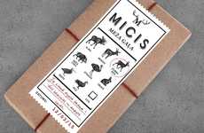
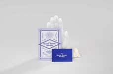
There is something so visually appealing about this new crafty branding identity for Mild Whistle. With a bold color palette that focuses on just three hues: a warm white, a turquoise blue and an understated bronze, the design whizzes at Oddds get it just right.
Able to intertwine both a contemporary look and a slightly historical symbolic look at the same time, this crafty branding identity is bound to get Mild Whistle a whole lot of attention. The design team also made the perfect choices when it came to the casual bold typeface, the simple random illustrations used to give a little flair, the shapes used and the touch of glam with the use of bronze.
“Mild Whistle identity stems from a paradox effect surrounded by a combination of funk layering beyond formality. Like a gentle thunder – where two opposites or complexities brings about the designer’s works as it; being louder than what the designer intends,” says the team from Oddds.
Trend Themes
-
Contemporary Symbolic Design — Opportunity for other brands to incorporate bold yet simple design elements with a touch of historical symbolism to make their branding stand out.
-
Minimalistic Color Palette — Opportunity for brands to experiment with a limited number of colors, but still create a visually appealing and distinctive brand identity.
-
Casual Yet Bold Typeface — Opportunity for brands to use a typeface that balances a casual and friendly vibe with a powerful and impactful presence.
Industry Implications
-
Graphic Design — Graphic design firms and agencies can utilize the Mild Whistle branding as inspiration when creating brand identities for their clients.
-
Marketing and Advertising — Marketing and advertising professionals can incorporate the concept of clever and eye-catching branding into their campaigns and strategies.
-
Packaging Design — Packaging designers can take cues from the minimalistic color palette and bold typography used in the Mild Whistle branding to create packaging that stands out on store shelves.
6
Score
Popularity
Activity
Freshness
