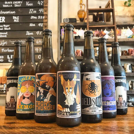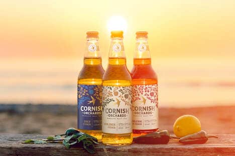

UK-based Acorn Brewery has taken on a new branding and labeling concept that gives every beverage its own specific chalk label.
The chalkboard rebranding was facilitated by design and digital agency Hacksaw, which took inspiration from the presence of chalk at the brewery's flagship bar 'The Old No.7.' The agency created over 25 different chalk label drawings that were made as the basis for the Acorn's bottles, cans and draft tap handles. The approach is eye-catching because it creates a uniform theme, and yet allows for each beer to take on its own individual look and approach.
Each different craft beer receives its very own chalk color and font set against a black label for a pleasing chalkboard look. Each new label is therefore able to become as unique as the different types of craft beer tastes that the brewery represents.
Why This Trend Is Growing
- Chalkboard Branding
- The use of chalkboard designs and labeling in packaging creates a distinct and memorable visual identity for products, particularly in the craft beer industry.
- Customizable Packaging
- Customizing packaging for individual products allows for greater personalization and uniqueness, which can improve consumer engagement and loyalty.
- Incorporating Local Culture in Branding
- Drawing inspiration from local culture and history, as seen with Acorn Brewery's chalkboard branding, can create a stronger connection with consumers and differentiate products from competitors.
Industries Being Reshaped
- Craft Beer
- Craft beer breweries can utilize chalkboard branding to create a differentiated and memorable visual identity for their products.
- Packaging Design
- Customizable packaging can be applied to a variety of industries and products to increase consumer engagement and differentiation.
- Digital Marketing and Design
- Digital design agencies can offer customized branding solutions, such as the chalkboard branding seen with Acorn Brewery, to help clients create a distinctive and memorable visual identity.