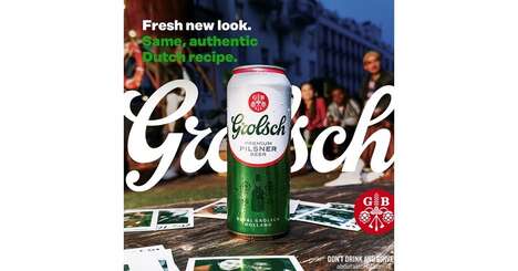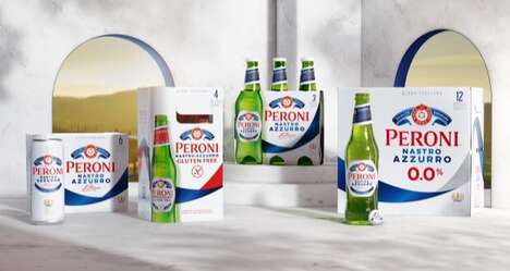
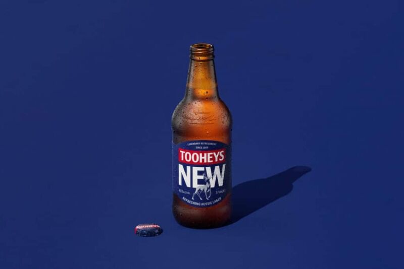
With a revamp of the brand's packaging created by creative firm Weave, Australian brewery Tooheys has launched a daring new appearance for its assortment of beers. The new packaging adopts modern design cues and features the brand's logo in bold red, 'NEW' written in white font, and Toohey's signature stag.
The modern new design is said to showcase Tooheys' primary brand assets while still referring to the brand's long 154-year heritage. This is the first significant modification to the brand's fundamental packaging since 2015.
"Tooheys is a brand that has over a century and a half of stories under its belt - so there is a challenge in moving too far away from the past and our rich legacy," said Chris Allan, a spokesperson for the company. “We feel the new packaging pays tribute to our proud heritage as well as modernising in a way that allows the core brand assets to shine.”
Image Credit: Tooheys
Key Themes Behind This Trend
- Beer Branding Revamp
- Opportunity for creative firms to offer redesign services to established beer brands.
- Modern Design Cue Adoption
- Opportunity for packaging material manufacturers to offer new design cues to brands.
- Honoring Heritage in Rebranding
- Opportunity for breweries to rebrand without losing their heritage and legacy.
Where This Applies
- Breweries
- Breweries looking to rebrand can look to balancing modern design cues with their heritage.
- Creative Firms
- Creative firms can offer redesign services to established beer brands looking to modernize their image without losing their history and legacy.
- Packaging Material Manufacturers
- Manufacturers can offer new design cues to brands looking to update their image.