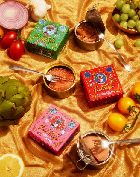
This example of canned seafood branding hails from Montreal and was created by graphic design students Dang Vo & Yen Vy Vo of UQAM. The fictitious brand is called Marine and features textured paper and steel cans as the primary materials involved.
The seafaring branding concept boasts a different textured experience for each variety of fish, making it easy to experience the difference as soon as one picks up a can. Using maritime imagery such as fishing nets and textured paper that feels like fish scales, the overall experience of the range of Marine products is decidedly upscale with an emphasis on style and of communicating the freshness of the product by conveying its proximity to its origins.
What Makes This Trend Stand Out
- Textured Packaging
- There is an opportunity for companies to use textured materials in packaging to create a more engaging and sensory experience for consumers.
- Seafood Branding
- There is a potential for seafood companies to develop unique and visually appealing branding concepts to differentiate themselves in the market.
- Marine-inspired Design
- There is a possibility for businesses to incorporate maritime elements and design cues to evoke a sense of premium quality and authenticity.
Sectors Adopting This
- Packaging
- Companies in the packaging industry can explore the use of textured materials to enhance the overall product experience for consumers.
- Seafood
- Seafood companies can adopt visually striking branding concepts to stand out in a crowded market and attract a broader consumer base.
- Graphic Design
- Graphic design professionals can explore marine-inspired themes and imagery to create unique branding concepts for various products and industries.