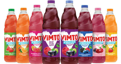
Viviana is a brand of nutritional food products that also happens to boast a beautiful branding design. Focusing on simple imagery and even more simple typography -- at least visually simple -- the packaging easily classifies what each bottle contains. How so? Through pictures of the ingredients neatly piled. Since Viviana appears to consist of spices specifically, these images add an element of vibrancy to the designs.
The packaging was designed by Mexican graphic studio Anagrama. Viviana is a name that comes from the Spanish words vivir and vida, meaning living and life. This beautiful sentiment is carried throughout the branding from beginning to end. Trendland writes, "One of the main values that the brand represents, is the main reason they decided to maintain the consistently simple and concrete graphic language in the logotype and packaging."
Why This Trend Is Growing
- Ingredient-inspired Branding
- Opportunity for brands to incorporate imagery of ingredients in packaging design to communicate product identity.
- Simple Typography
- Potential for brands to utilize visually simple typography to create a clean and cohesive branding design.
- Vibrant Imagery
- Trend towards using vibrant images of ingredients to add a lively element to packaging design.
Industries Being Reshaped
- Food & Beverage
- Opportunity for food and beverage companies to adopt ingredient-inspired branding to enhance product appeal.
- Design & Branding
- Potential for graphic design and branding agencies to offer expertise in creating visually simple and impactful packaging designs.
- Spices & Seasonings
- Trend towards incorporating vibrant imagery of ingredients in packaging design presents an opportunity for spices and seasonings industry to differentiate their products.