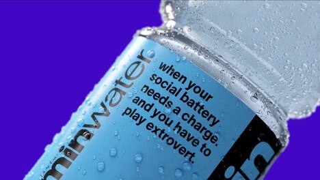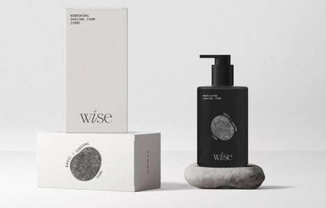
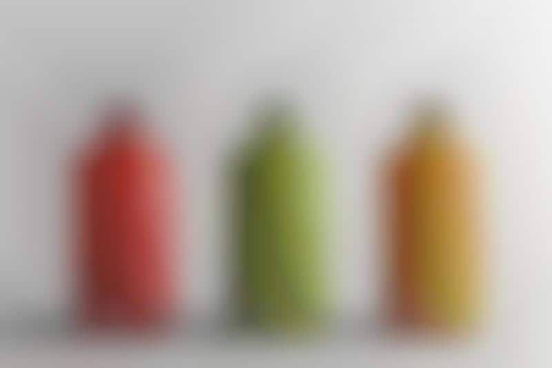
This minimalist juice packaging makes a bold statement while embracing simplicity. Rather than adorning bottles with vivid graphics or labels, creative agency Zeisla Team instead opts for a clean design that strongly relies on typography.
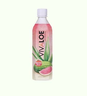
Featuring a clean design style that spotlights colorful fruit juices -- from watermelon to orange and mango -- this beverage packaging is also accented with blog letter signage that simply reads "Juice."
While this minimalist juice branding may seem to simple to some, its design makes a powerful statement in a subtle way. The visually striking brand identity by Zeisla Team is also a metaphor for a fictional brand's all-natural ingredients that are blended without any added preservatives or artificial sweeteners.
Why This Trend Is Growing
- Minimalist Branding
- The trend towards minimalist branding in product packaging aims to communicate simplicity and purity.
- Typography-based Design
- The use of typography as the main design element in packaging design is a trend that highlights the importance of clear and simple communication.
- Fruit Flavor Emphasis
- Brands are placing a greater emphasis on fruit flavor in product design as consumers increasingly seek healthier and natural options.
Industries Being Reshaped
- Beverage Industry
- Minimalist branding and typography-based design present an opportunity for beverage companies to differentiate themselves and showcase product purity and simplicity.
- Food Industry
- The trend towards emphasizing fruit flavor as a selling point can be leveraged by food companies across various categories such as snacks, desserts, and breakfast items.
- Design Industry
- The shift towards minimalist branding and typography-based design is an opportunity for design agencies to provide innovative and effective solutions for brands looking to communicate simplicity and clarity.