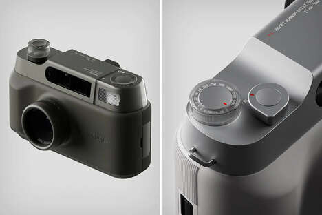
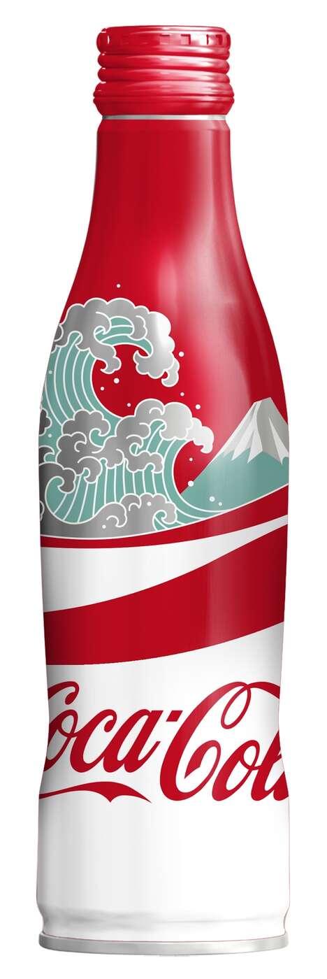
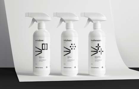
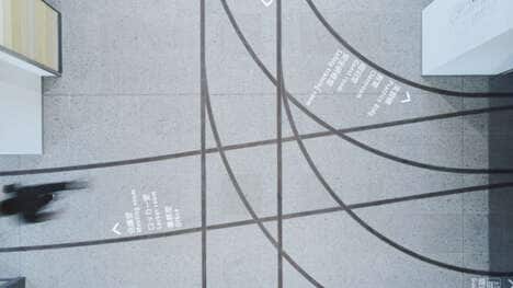
The 'Made in Japan' by Antrepo series utilizes sleek Japanese minimalist to re-imagine some of the most iconic logos of today.
Inspired by the uniformity of vintage 35 mm cameras seen in the seventies and eighties, each image depicts conceptual logos that are thoroughly simplified. The symbols are monochromatic, taking away the colorful quality that defines the branding of each corporation.
It is interesting to see such recognizable logos depicted in the style of Japanese minimalism. Minimalism is undoubtedly having a moment as it has been interpreted in modern fashion, architecture and art. 'Made in Japan' by Antrepo gives new life to well-known symbols.
What Makes This Trend Stand Out
- Japanese Minimalism
- The trend of Japanese minimalism can be implemented in branding and logo design to create sleek and uniform visual identities.
- Monochromatic Branding
- Reducing branding to monochromatic colors can simplify visual identities while maintaining recognition and adding a timeless quality.
- Revamping Established Logos
- Updating and simplifying established logos can give them new life and appeal to modern consumers.
Sectors Adopting This
- Marketing and Branding
- Marketing and branding agencies can utilize minimalist and monochromatic design to create unique and memorable visual identities for their clients.
- Fashion
- Fashion designers can implement Japanese minimalism and monochromatic colors in their designs to create sleek and timeless garments that stand out in a crowded market.
- Advertising and Media
- Advertising and media companies can use the trend of revamping established logos to create engaging content and attract new audiences.