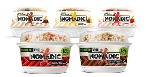

Creating a connection with consumers has become essential for product packaging in order to help incite a repeat purchase, so the Hummingbird porridge branding has been given a cheery design to make it truly family oriented.
Designed to look like a milk carton, the cereal has a good morning message on the back to help encourage consumers to slow down, read it and enjoy something to eat before leaving the house. This correlates simple sustenance like porridge to a positive mindset and thus makes it more appealing for consumers to keep on hand because of the way it makes them feel.
The Hummingbird porridge packaging is the design work of TABOO and has been created with urban consumers in mind who live busy lifestyles.
Why This Trend Is Growing
- Inviting Packaging Design
- Opportunity to create packaging that engages and connects with consumers on an emotional level, encouraging repeat purchases.
- Family-oriented Branding
- Opportunity to develop branding that appeals to families and promotes a positive mindset towards the product.
- Urban Consumer Targeting
- Opportunity to tailor packaging and branding to appeal to busy urban consumers.
Industries Being Reshaped
- Food Packaging
- Opportunity for food packaging companies to design packaging that creates an emotional connection with consumers.
- Cereal Manufacturing
- Opportunity for cereal manufacturers to develop family-oriented branding and messaging to increase product appeal.
- Advertising and Marketing
- Opportunity for advertising and marketing agencies to help brands target and engage urban consumers with their packaging and branding.