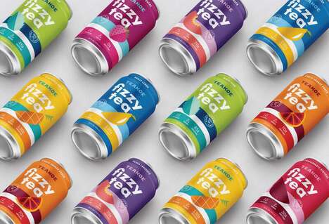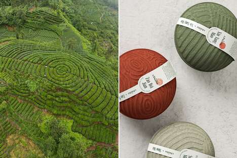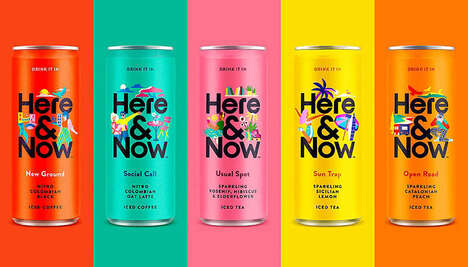
To reinvent Han Tea, Roberta Choi went with a colorblocking motif, which worked perfectly to make these items stand out on the shelves.
The top part of the packaging is done all in black, allowing for the tea logo to pop and become noticeable. On the lower half of the packaging, color is used in one blocked section. These hues include green, yellow, orange and purple, all pigments that are extremely bright. Interestingly, the lid area of the Han Tea package has oriental influence, with certain characters used (although Choi does not say the actual origin of this lettering). This feature gives the tea branding an added sense of exoticism, which will hopefully tempt people into purchasing the brand.
Key Themes Behind This Trend
- Colorblocking Branding
- Other industries can adopt the colorblocking motif in their product packaging to make their items stand out on the shelves.
- Oriental-inspired Design
- Industries can incorporate Chinese characters and other oriental-inspired designs to create a unique and innovative branding strategy.
- Bright Hues Design
- Industries can use bright pigments such as green, yellow, orange, and purple in their product packaging to make their items more noticeable and visually appealing.
Where This Applies
- Food and Beverage
- Other food and beverage brands can use the colorblocking motif and oriental-inspired design to create a unique and innovative branding strategy, and attract customers to their products.
- Fashion
- Fashion brands can use the colorblocking motif and bright hues design in their product packaging or clothing design to create a bold and eye-catching look.
- Personal Care
- Personal care brands can incorporate the colorblocking motif and oriental-inspired design in their product packaging, and use it as a way to differentiate themselves from competitors.