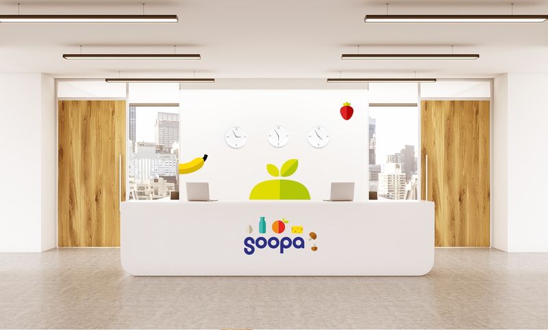
"Casual, non corporate, supermarket, savings and fun experience" are words used to describe this grocer branding concept for Soopa. The project was conceived by Creogram Branding & Digital Agency.
The agency's creative team collaborated to help this food brand set itself apart from competitors with signature illustrations, promotional materials, interior design elements, and even and animated short used to promote its premium products.
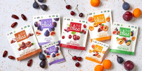
Fusing sleek design lines with vivid product symbols, this grocer branding is eye-catching and modern. The brand's understated visual identity embodies sophistication and will appeal to a MIllennial audience. Soopa's branding fuses clean backdrops with colorful illustrations of fruits, veggies, and other food items along with a playful font to tie its theme together.
Key Themes Behind This Trend
- Casual Supermarket Branding
- Opportunity to disrupt the grocery industry by creating playful and non-corporate visual identities for supermarkets.
- Vivid Product Symbols
- Innovative opportunity to incorporate eye-catching and modern symbols to enhance the visual identity of consumer products.
- Animated Promotional Content
- Disruptive potential in creating animated short films to promote premium products and enhance brand recognition.
Where This Applies
- Retail
- Opportunity for retailers to differentiate themselves by adopting casual and playful branding concepts that create a non-corporate atmosphere.
- Consumer Goods
- Innovative branding approach that incorporates vivid product symbols can set consumer goods companies apart and attract a Millennial audience.
- Advertising and Marketing
- Disruptive potential lies in creating animated promotional content for brands to engage consumers and generate interest in their products.