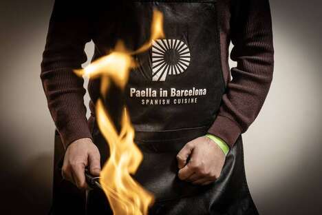

Moscow-based design agency Tomatdesign is challenged to create a dynamic brand identity for fast food chain ‑PitStop–. As the market is incredibly competitive, the restaurant found that "express service, fair prices, and a wide range of meals" are not enough. In an attempt to actively engage its consumer base, the dining establishment taps into Tomatdesign for a brand refresh as the visual language of a corporate entity is inherently important in the quest for success.
The creative firm focused on producing a dynamic brand identity that is inspired by ‑PitStop– itself. Drawing on the obvious implications of the name, Tomatdesign began developing the graphic language from the saying 'Life is a Race. Refuel!' Simple and straight to the point, this approach inflicts motion and is somewhat motivational.
Key Themes Behind This Trend
- Dynamic Brand Identities
- As consumer engagement rises in importance, businesses could benefit from using dynamic brand identities that are inspired by their core values and enhance brand recognition.
- Motivational Graphic Language
- By using simple and motivational graphic language that inflicts motion, brands can capture attention and stand out from competitors.
- Innovative Restaurant Branding
- Creative branding that incorporates a restaurant's core values and encourages engagement could lead to increased customer loyalty and business success.
Where This Applies
- Fast-food Chain Industry
- Companies within the fast-food chain industry could benefit from a brand refresh that incorporates dynamic and motivational graphic language to improve customer engagement and brand recognition.
- Graphic Design Industry
- The graphic design industry could potentially play a major role in helping companies revamp their brand identities to capture consumer attention and stand out from competitors.
- Creative Agency Industry
- Creative agencies that specialize in innovative branding have the opportunity to provide businesses with unique and engaging brand identities that could enhance business success.