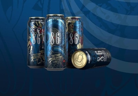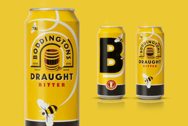

This packaging for Boddingtons Draught Bitter was designed to be bright and bold, appealing to a younger group of consumers. As a brand that likes to tout its confidence and irreverence, this design by jrk was designed to step outside comparable products within the same category.
As a symbol of Manchester’s hive of industry, the design includes a large uppercase B and actual bees, which help to counter the word "Bitters" and suggest that the beer has a sweetness to it, since it does have a slight floral aroma. With its bright yellow coloring, bold text and graphics, this is a surefire way to make sure that all eyes are on this new beer can design, especially since the last time it was updated was 14 years ago.
What's Driving This Trend
- Bright Packaging Design
- Opportunity for brands to appeal to younger consumers by creating bright and bold packaging designs.
- Incorporating Symbols and Icons
- Brands can use symbols and icons to create unique packaging that sets them apart from competitors.
- Updating Outdated Designs
- There is potential for brands to disrupt the market by updating outdated packaging designs and capturing consumer attention.
Who This Affects Most
- Alcoholic Beverages
- Opportunity for alcoholic beverage companies to attract younger consumers by redesigning their packaging to be bright and bold.
- Graphic Design
- Brands can leverage graphic design to incorporate symbols and icons into their packaging, providing a unique selling point.
- Consumer Goods
- Companies in the consumer goods industry can disrupt the market by updating outdated packaging designs and appealing to modern consumers.