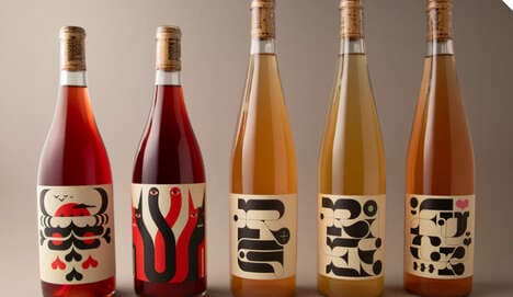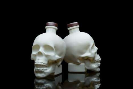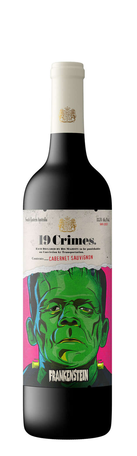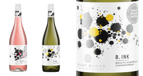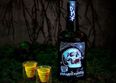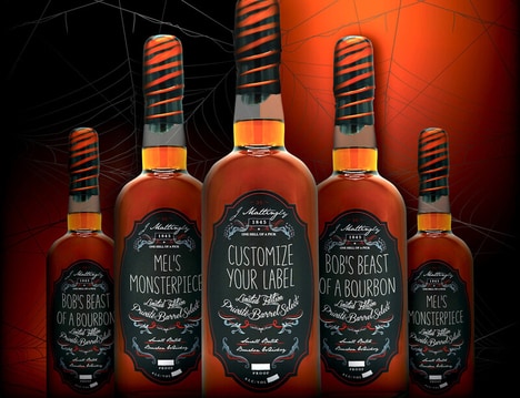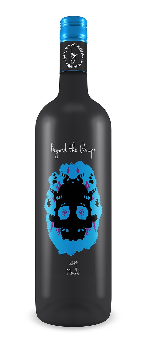
Not shying away from a theme suitable for Halloween, Beyond the Grape Wine went with a skulled inkblot design for its latest label. However, the skull shape is much more subtle rather than going with a pirate-like crossbones look.
The space surrounding the skulls looks like someone has taken a paintbrush and slapped a coat of paint on the bottle, as each one's edges are slightly different. Instead of just sticking with one color, Tyler Wergin, the designer behind the branding, opted for three: blue, pink and green. Each hue is vibrant enough to make the inkblot skull stand out even more.
For anyone in the mood for Halloween, or who just loves horror movies, this skull-based design is the perfect fit for a good bottle of wine and an entertaining label.
Key Themes Behind This Trend
- Skull-themed Packaging
- Opportunity for wine companies to appeal to the Halloween and horror movie enthusiast market by incorporating skull-themed designs on their wine packaging.
- Inkblot Design
- Incorporating inkblot designs on product packaging as a unique and eye-catching visual element that adds intrigue and artistic flair.
- Multicolored Packaging
- Using multiple vibrant colors on packaging to create a visually striking and attention-grabbing product design.
Where This Applies
- Wine
- Opportunity for wine producers to differentiate themselves and attract a niche market by creating packaging with a horror-themed design.
- Graphic Design
- Opportunity for graphic designers to work with wine companies in creating visually appealing and theme-specific packaging designs.
- Entertainment
- Opportunity for entertainment companies or horror-themed events to collaborate with wine brands to create limited edition wine packaging for special occasions.