


The Southwest Airlines Rebrand
Rebecca Byers — March 4, 2015 — Marketing
References: underconsideration & designtaxi
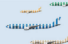
While the new logo was revealed in late 2014, the Southwest Airlines rebrand by Lippincott continues to take shape as images of promotional materials hit the Internet. The vibrant rebranding effort features a heart-shaped logo and a colorful red, purple and yellow palate, as exemplified in the new images of plane tickets and in-flight snacks.
Lippincott enlisted the help of Monotype Studio to create a proprietary typeface that suited the brand's new vision, aptly titled Southwest Sans.
The Southwest Airlines rebrand is one of several airlines attempting to cultivate a strong and positive brand image that counteracts the negative stereotype associated with economy air travel. With amped up security measures that have redefined the air travel experience in the last decade, many airlines are looking to cultivate emotionally intelligent campaigns that connect with consumers in a human way.
Trend Themes
-
Humanized Airline Rebranding — Airlines are attempting to cultivate strong and positive brand image through emotionally intelligent rebranding campaigns that connect with consumers in a human way.
-
Vibrant Branding — Airlines are adopting bright and bold colors and incorporating vibrant logos and typefaces for their new branding, a trend that could disrupt the traditional airline branding landscape.
-
Emphasis on Positive Brand Image — Airlines are focusing their branding efforts on promoting a positive image to counteract negative stereotypes associated with economy travel, presenting an opportunity for disruptive innovation in the airline industry.
Industry Implications
-
Airline Industry — The airline industry is undergoing a transformation in branding efforts with many airlines adopting a vibrant and humanized branding strategy that could disrupt the traditional industry landscape.
-
Design Industry — As airlines are rebranding with new vibrant logos, colors, typefaces, and promotional materials, there is an opportunity for the design industry to play a major role in the rebranding efforts.
-
Consumer Goods Industry — Through its rebrand, Southwest Airlines have introduced new in-flight snacks, offering possibilities for the consumer goods industry to innovate with options that cater to the humanized rebranding strategy many other airlines are embracing.
3
Score
Popularity
Activity
Freshness