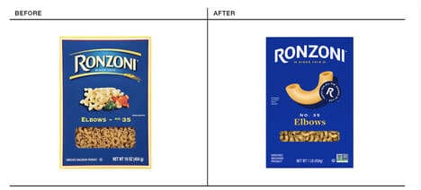
Stockholm-based Fabrizio Morra and studio Snask embark on a rebranding initiative for popular European lens and eyewear retailer Lensway. The new visual identity was created to boost the business' visibility on the market. The graphic designers were tasked with re-imaging the appearance of the brand and creating a lasting impression through typography, colors and iconography that would enhance consumer loyalty.
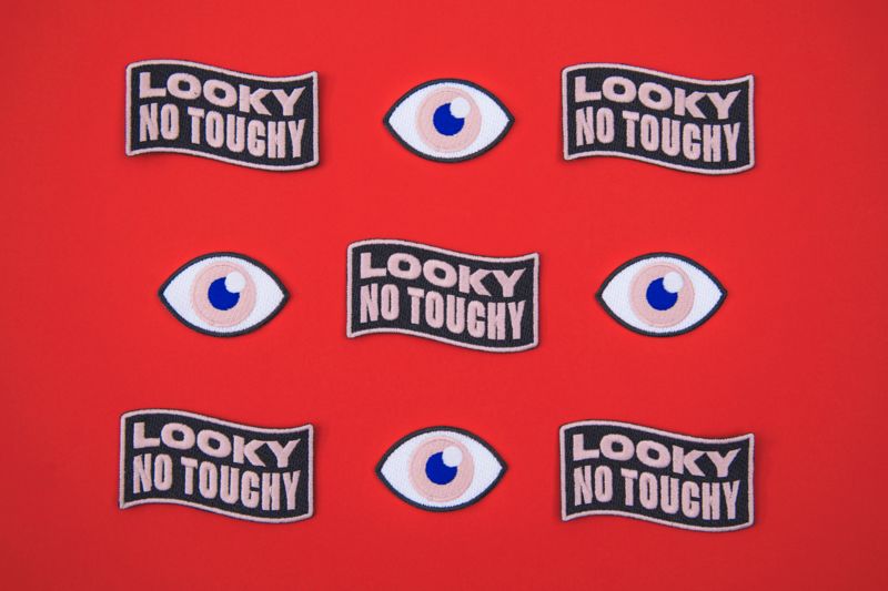
The re-branding initiative affected everything except the logo. Fabrizio Morra and Snask focused on bringing a strong-hued visual identity to Lensway by selecting vibrant reds, blues and a soft beige as primary colors. The duo also incorporated simplistic eye icons and a beach theme. This gives the re-branding initiative an ultra-playful attitude that is sure to draw consumer attention.
Why This Trend Is Growing
- Visual Identity Rebranding
- Opportunity for graphic designers to re-imagine a brand's appearance and create a lasting impression through typography, colors, and iconography.
- Enhancing Consumer Loyalty
- An opportunity to boost business visibility on the market by creating a visually appealing and engaging brand identity.
- Playful Attitude
- Opportunity to incorporate vibrant colors, simplistic icons, and themes to draw consumer attention and create a memorable brand image.
Industries Being Reshaped
- Graphic Design
- A rebranding initiative opens up a market for graphic designers to help businesses create a visually appealing and engaging brand identity.
- Retail
- Rebranding initiatives can enhance consumer loyalty and visibility in the competitive retail market.
- Eyewear
- Opportunity for eyewear retailers to revamp their brand image and attract customer attention through vibrant colors and playful themes.