French designer Antoine Derriey infused plastic cups into his typography and came up with a typeface that is perfectly appropriate for summertime.
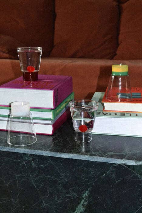
The Paris-based creative used 350 cups to arrange the word "Chilly." He chose that particular word to represent a cool, refreshing summer vacation. To also signify beating the heat, he filled the cups with green mint syrup; the mint is seen as a refreshing flavor, while the coloring in the cups represents water.
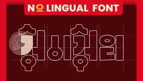
The typeface he came up with using the plastic cups is like a mixture of the Gothic and Goudy text fonts, except they have a more smooth and rounded structure and a bubbly texture. He first physically created the typeface and then mimicked it digitally. The digital version unfortunately does not relay the messages of summer as effectively as the physical version.
What Makes This Trend Stand Out
- Plastic Cup Typography
- Using plastic cups as a creative medium for typography.
- Summertime Typography
- Creating typefaces that evoke the feeling of summer and vacation.
- Physical Vs. Digital Typography
- Exploring the limitations and differences between physical and digital typefaces.
Sectors Adopting This
- Graphic Design
- Opportunity for graphic designers to experiment with unconventional materials and create unique typographic designs.
- Food and Beverage
- Innovating packaging design through the integration of typography and edible products, enhancing brand storytelling.
- Printing and Publishing
- Exploring the potential of physical typography in printed materials to create more engaging and tactile experiences for readers.