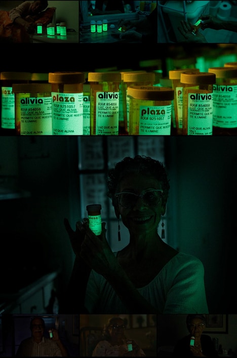

Istanbul-based designer Ipek Eris conceived Rumeli70's pharmacy branding. Unlike most pharmacies that can be marketed with bare and institutional graphics, this medical retailer is more playful and eclectic. Referencing Turkish art and design, Ipek Eris creates a brand identity that is showcased using white and gold and royal purple and gold motifs.
In addition to Rumeli70's vivid promotional materials, the pharmacy's packaging is apothecary-inspired. In addition to branded cream and balm containers, this pharmacy branding project also focuses on old-fashioned glass bottles that are used for syrups, ointments and other liquid remedies.
Moreover, the pharmacy's paper bags and product wrappers also feature a mix of royal purple and gold branding that references vintage apothecary packages. Rumeli70's main logo is a medicine bottle with wings, suggesting that the retailer is a god-send when it comes to natural and healthy remedies.
Why This Trend Is Growing
- Playful Pharmacy Branding
- Disruptive innovation opportunity: Explore creative and vibrant branding strategies for pharmacies to distinguish themselves in the market.
- Apothecary-inspired Packaging
- Disruptive innovation opportunity: Develop unique and nostalgic packaging designs for pharmacies that evoke a sense of tradition and authenticity.
- Vintage Apothecary References
- Disruptive innovation opportunity: Incorporate retro design elements into pharmacy branding to create a unique and memorable customer experience.
Industries Being Reshaped
- Pharmaceutical Retail
- Disruptive innovation opportunity: Embrace innovative branding and packaging techniques to differentiate pharmacies and attract customers.
- Design and Advertising
- Disruptive innovation opportunity: Provide creative services to pharmacies to help them create compelling and visually appealing brand identities.
- Art and Culture
- Disruptive innovation opportunity: Collaborate with pharmacies to infuse cultural references and artistic elements into their branding and packaging.