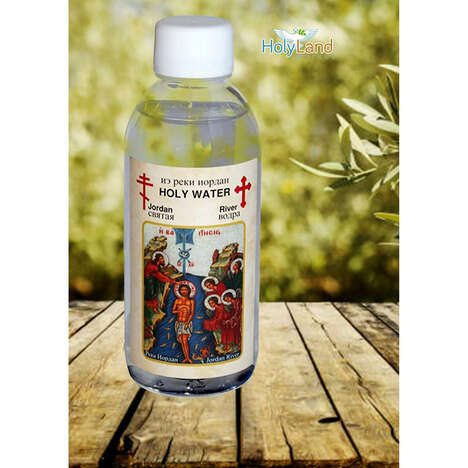
For those who ever wanted a taste of holy water, this H2o packaging concept by Manjia Zhao is the closest you will get sipping the good stuff without being reprimanded by the priest. The work was done for a school project, and Zhao decided to go with a devilish take.
The numbers 666 were used to symbolize the devil and hell on the front of the bottle, along with a sword right down the center. To represent the thorns that Jesus wore, part of the label features a few prickly illustrations for a complete look. This design was then placed directly on the bottle, instead of using a paper backing. The result is a devilish packaging design.
What Makes This Trend Stand Out
- Religious Packaging
- Religious packaging is becoming more creative, even controversial, like this devilish take on holy water.
- Unconventional Labeling
- Using unconventional labeling, such as the numbers 666, can be a way to make a product stand out and start conversations.
- Personalized Packaging
- Creating personalized packaging for niche markets, such as holy water, can lead to increased sales and brand loyalty.
Sectors Adopting This
- Religious Goods
- Religious goods companies can tap into the trend of unconventional religious packaging to stand out and appeal to younger generations.
- Beverage
- Beverage companies can explore personalized packaging options to differentiate their products and attract niche audiences.
- Design
- The design industry can embrace the trend of unconventional labeling and religious packaging to create disruptive innovations that cater to new markets.