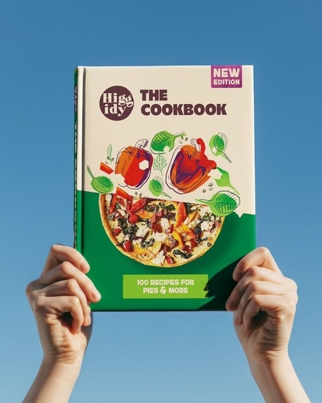
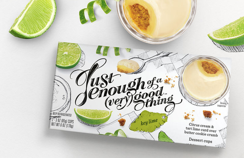
Most people know a good thing when they see it and this packaging for Enough of a (Very) Good Thing makes sure it hits you in the face. The single-serve desserts come in decadent flavors like Key Lime, Chocolate & Vanilla, Tiramisu and Lemon Cream, providing little tastes of indulgence.
The most dominant part of the packaging by Pearlfisher is the typography, which is quite playful. The "J" on the Enough of a (Very) Good Thing logo is shaped just like a small spoon, showing off the small size of the dessert. Each of the packages is a little bit different, with vibrant imagery and colors showing off the delicious flavors. With a white background, the presentation of the dessert is also stressed as something that's quite light to enjoy.
What's Driving This Trend
- Playful Typography
- Opportunity for innovative packaging designs that incorporate playful typography to create unique and eye-catching visuals.
- Variety of Flavors
- Opportunity to introduce a wide range of unique and indulgent dessert flavors to cater to diverse consumer preferences.
- Lightweight Packaging
- Opportunity to develop packaging that emphasizes the lightness of the product, enhancing the perception of a guilt-free indulgence.
Who This Affects Most
- Food Packaging
- Disruptive innovation opportunities in the food packaging industry by embracing playful typography and creating visually appealing designs.
- Dessert Industry
- Opportunity to disrupt the dessert industry by introducing a wide variety of unique flavors and appealing to consumers' desire for indulgent, single-serve options.
- Health-conscious Food Market
- Opportunity to capture the health-conscious food market by emphasizing the lightness and guilt-free indulgence of the dessert through innovative packaging.