There is an undoubted element of indulgence to the contents of Chilly Moo packaging but its graphic designer chose to highlight a different aspect of this sweet dairy product. Appealing to energetic children and their health-conscious parents, the visual identity of this frozen yogurt line emphasizes physical activity and the scrumptious fruit ingredients inside.
For a bit of nostalgia, Steve Simpson set the backgrounds of these ice cream tubs with colorful vertical candy stripes. Quirky cartoony illustrations brand each container with a red, blue or yellow cow engaged in skipping, rollerskating or scootering. Dressed with a scarf and a sweater for the cool outdoors, the Chilly Moo packaging mascot is flanked by strawberries, raspberries and bananas to promote a zestful lifestyle and wholesome eating habits.
What's Driving This Trend
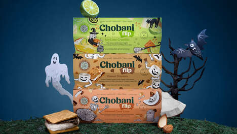
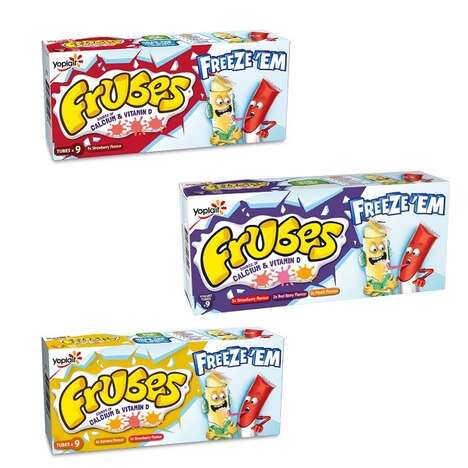
- Dynamic Packaging Designs
- Incorporating vibrant, interactive illustrations and graphics into packaging designs to appeal to target audiences.
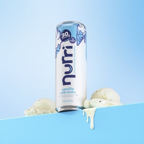
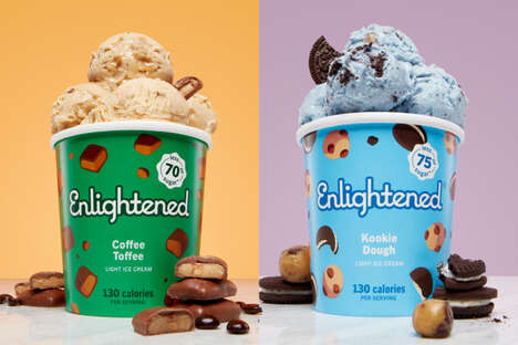
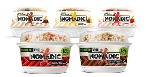
- Health and Wellness Promotion
- Using visual elements and branding to promote a healthy lifestyle and nutritious food choices.
- Nostalgic Design Elements
- Incorporating nostalgic design elements, such as candy stripes, to evoke feelings of nostalgia and attract consumers.
Who This Affects Most
- Food and Beverage Packaging
- Exploring innovative packaging solutions that engage consumers and create memorable brand experiences.
- Frozen Yogurt Industry
- Leveraging packaging and branding strategies to differentiate frozen yogurt products in a competitive market.
- Healthy Snack Industry
- Utilizing visual identity and design elements to promote healthier snack options and appeal to health-conscious consumers.