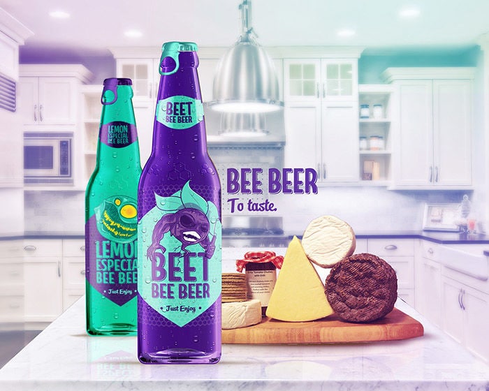
The vibrantly neon colored beer label and packaging design for Bee Beer was created by Thiago Rodrigues dos Santos. The use of bold and bright colors presents an appealing and fresh beer label.
With the heightened competition in the craft beer industry, it is vital to make a statement via smart packaging -- as done with the conceptual branding scheme. The Bee Beer is a brewery that creates two unique beer flavors of beetroot and lemon. Both beers use the colors purple and turquoise. They are differentiated by alternating the color of writing and the color of the label.
Each beer is further defined by the cartoon image illustrated on each. The lemon beer is represented by a cartoon face that looks like a lemon wedge making a sour face. The beetroot brew features a cartoon beet with extremely muscular arms.
Key Themes Behind This Trend
- Neon Beer Packaging
- Bold and bright neon-colored beer packaging designs that make a statement in the craft beer industry.
- Smart Packaging
- Utilizing innovative packaging designs to stand out in a competitive market.
- Conceptual Branding
- Creating unique and visually appealing branding schemes to attract customers.
Where This Applies
- Craft Beer
- Craft breweries focusing on vibrant and eye-catching beer packaging to differentiate their products.
- Beverage Packaging
- Exploring creative packaging designs for beverages to enhance brand perception and visibility.
- Graphic Design
- Incorporating innovative graphic design elements into packaging to create a unique and memorable brand identity.