


Jennifer Foote Re-Brands Hot Chocolate for Williams-Sonoma
Jamie Danielle Munro — April 30, 2014 — Lifestyle
References: behance.net & packageinspiration
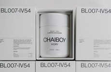
For a student project, Jennifer Foote examined how to update hot chocolate packaging for Williams-Sonoma. She decided that the intrigue could be placed in the fine details, instead of going for a drastic change. To differentiate between the various flavours of the brand, Foote used alternating forms of patterns and texture. This ultimately helped distinguish the offerings of Williams-Sonoma, and also make for an attractive piece of packaging.
For the texture and coloring, Foote used deep browns, grays and blacks for the hue palette. This choice worked well because it reflected the hot chocolate contents inside, which would hopefully make consumers more likely to buy the product. The patterns ranged from swirled lines around the can to a criss-crossed diamond pattern, all of which was executed with perfection.
For the texture and coloring, Foote used deep browns, grays and blacks for the hue palette. This choice worked well because it reflected the hot chocolate contents inside, which would hopefully make consumers more likely to buy the product. The patterns ranged from swirled lines around the can to a criss-crossed diamond pattern, all of which was executed with perfection.
Trend Themes
-
Subtle Packaging — The trend of using subtly textured packaging is disrupting the packaging industry as it creates intrigue and differentiation for products.
-
Fine Details — The trend of focusing on fine details in packaging design presents disruptive innovation opportunities for brands to enhance the overall aesthetic appeal of their products.
-
Pattern and Texture — The trend of incorporating alternating forms of patterns and textures in packaging design provides an opportunity for brands to create visually attractive and distinct packaging solutions.
Industry Implications
-
Packaging — The packaging industry can leverage the trend of subtle texture and fine details to create innovative designs that captivate consumers and enhance brand differentiation.
-
Food and Beverage — The food and beverage industry can adopt the trend of pattern and texture in packaging to create visually appealing product presentations that entice customers and drive sales.
-
Design and Branding — The design and branding industry can explore the trend of incorporating fine details and subtle packaging to offer innovative solutions that elevate brand identity and consumer experience.
2.4
Score
Popularity
Activity
Freshness