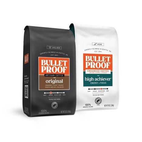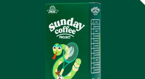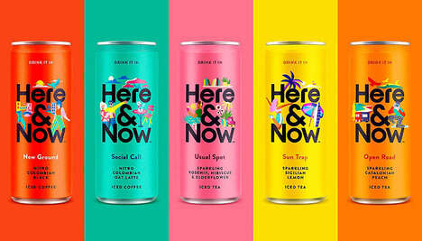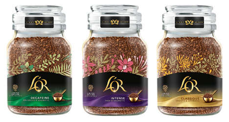


When B Brand Design of Australia was assigned the task of breathing life into Rhino Coffee packaging, they decided that the best way to do this was to avoid using the image of a steaming cup of java at all costs. The familiar picture is plastered all over every brand of brew on the grocery store shelf, and now one stands out with a visual strength that may metaphorically charge its competitors.
Befitting the name of the product, a rhinoceros was chosen to mark each bag of ground beans, loaded with symbolism of robustness. This quality is consequently assumed to comment on the flavor of the drink inside Rhino Coffee packaging, combined with further themes like adventurousness and exoticism which come from the allusion to the African safari. Bold colors of orange and magenta pack even more of a punch.
Key Themes Behind This Trend
- Symbolic Branding
- Branding based on metaphorical or symbolic images rather than literal representations can help a product stand out in a crowded market.
- Exotic Themes
- Using themes of exoticism can add an adventurous quality to a product and make it more appealing to consumers.
- Color Branding
- Bold, vibrant colors can help a product catch a consumer's eye on a crowded grocery store shelf.
Where This Applies
- Coffee and Tea Industry
- In an industry crowded with choices, unique packaging strategies can be the key to standing out and winning market share.
- Consumer Packaging Industry
- Consumer packaging designers have the opportunity to innovate by creating unique and visually striking designs that capture consumers' attention.
- Brand Design Industry
- Brand design professionals can innovate by exploring new, creative ways to help their clients' products stand out in a crowded market.