


Pediatric Babe Packaging is Clean, Crisp and Utterly Adorable
Amelia Roblin — April 12, 2013 — Life-Stages
References: thedieline
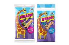
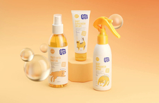
The minimalist visual identity strategy once had a very clinical look about it, but consumers are seeing items like Pediatric Babe packaging more and more frequently and responding quite favorably towards them. Starting with a plain white backdrop and featuring a great deal of empty space, these bottles of lotions and creams for kids seem to suggest a purity of the ingredients within.
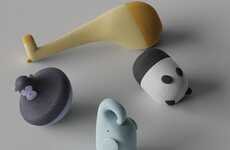
But keeping the demographic in mind, illustrator Juan Antón added a cute little cartoon to the front of every container. Drawn up with a single color and detailed with black and white accents, the charming mascots of Pediatric Babe packaging bring a lovely playfulness and approachability to the otherwise stark surfaces. The smiling critters appear to promise satisfaction with the products behind them.
But keeping the demographic in mind, illustrator Juan Antón added a cute little cartoon to the front of every container. Drawn up with a single color and detailed with black and white accents, the charming mascots of Pediatric Babe packaging bring a lovely playfulness and approachability to the otherwise stark surfaces. The smiling critters appear to promise satisfaction with the products behind them.
Trend Themes
-
Minimalist Packaging — Brands can leverage minimalist packaging to emphasize the purity and quality of their products.
-
Playful Branding — Adding cute and approachable illustrations to products can increase brand likability and appeal to young demographics.
-
Single Color Illustrations — Using a single color for detailed cartoon illustrations can create a cohesive and consistent brand identity.
Industry Implications
-
Skincare — Skincare brands can use minimalist packaging and playful branding to attract parents looking for safe and effective products for their kids.
-
Baby Products — Baby products industry can leverage the appeal of cute and approachable illustrations to engage with young parents looking for products for their infants and toddlers.
-
Health and Wellness — Health and wellness brands can use minimalist packaging and simple, clean branding to communicate the purity and quality of their products.
4.2
Score
Popularity
Activity
Freshness