New Pabst Blue Ribbon Packaging is Inspired by the Product's Name
Amelia Roblin — January 15, 2013 — Eco
References: nickjohnstondesign & packagingoftheworld
For a school assignment, Canadian designer Nick Johnston decided to revamp Pabst Blue Ribbon packaging. Two primary goals were pursued in this project that centered around a revival of the visual image and the reduction of material.
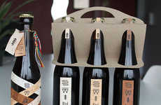
To tackle the latter, Nick decided to avoid the use of extra paper as padding between the bottles in the six-pack. In removing this grid, a perforated lid was positioned around the necks of the flasks. The question of a handle was then in need of addressing since no inserts were available to shape one.
It's here that the "ribbon" in the name of the beer was used as an integral component of Pabst Blue Ribbon packaging. A short length is fastened to the carton top spacer to create a loop for easy carrying.
Trend Themes
-
Minimalist Branding — Reducing packaging materials and simplifying design can create a sleek and modern look for traditional brands.
-
Innovative Packaging — Finding creative ways to incorporate the product name and features into packaging design can increase brand recognition and appeal.
-
Sustainable Six-packs — Eliminating unnecessary packaging materials and finding eco-friendly alternatives can appeal to environmentally-conscious consumers.
Industry Implications
-
Alcohol and Beverage — Innovative packaging design can differentiate brands in a competitive market and appeal to younger, design-savvy consumers.
-
Packaging and Printing — There are opportunities for companies to develop more sustainable and efficient packaging solutions for clients looking to reduce their environmental footprint.
-
Design and Advertising — Creating unique and visually appealing branding solutions can help companies stand out and attract new customers.
6.2
Score
Popularity
Activity
Freshness
