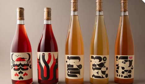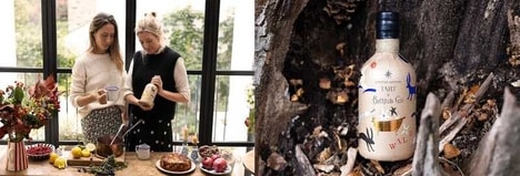

The right packaging can break or make the success of a product in the market place, and I have a feeling the quirky label branding for Odd Society Spirits’ debut product East Van Vodka will be the latter.
Created by Vancouver brand and design agency Cause+Affect, the quirky label exudes the charm that comes only with small craft distilleries like Odd Society Spirits.
The design agency took on all the branding identify of the distillery and its products, giving the whole brand a unique personality to help them stand out and stay true to their name.
“Most vodka labels give off airs of subtlety or blend into the background, much like the spirits themselves, but we wanted East Van Vodka to exhibit a unique character that matches its namesake community and to represent the unusual depth behind the product itself,” says the design team at Cause+Affect.
Designed around a fantastical portrait of ‘Cornelius’ the owl, the quirky branding label plays on the creative spirit of East Vancouver.
What's Driving This Trend
- Quirky Label Branding
- Exploring unique and charming packaging strategies that can enhance a product's success in the market.
- Craft Distillery Packaging
- Designing packaging that reflects the personality and story of small craft distilleries.
- Unconventional Spirits Packaging
- Creating packaging that breaks away from traditional designs to capture consumer attention and stand out in the market.
Who This Affects Most
- Design and Branding
- Opportunity to provide creative and unique packaging solutions for companies in various industries.
- Craft Distillery
- Chance to create packaging strategies that align with the brand identity and storytelling of craft distilleries.
- Beverage Industry
- Innovative packaging opportunities to differentiate products and attract consumers in the competitive beverage market.