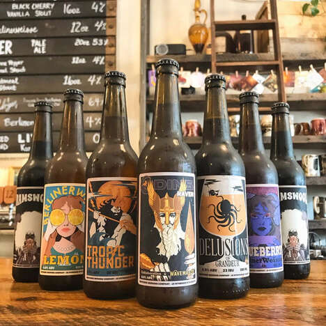
The goal is to hit the nail on the head with brand identity design, creating an image that will appeal directly to your target consumer in a compelling way. Hanys Beer packaging certainly does this both literally and symbolically. A simple icon is printed onto the matte black bottles that pictures a miner's hammer hitting its rocky target.
Referencing Silesian ancestry and the history and industry that surrounds coal mining in Europe, Tomasz Soluch has created a Hanys Beer packaging concept that will appeal especially to its relevant German and Polish market. But beyond this buyer base, the crisp, clean and hard-hitting appearance packs a punch to get the attention of international consumers as well.
Why This Trend Is Growing
- Heritage Branding
- Creating packaging designs that highlight a company's cultural heritage and history, attracting buyers with pride in their roots.
- Iconic Branding
- Designing simple and recognizable icons that promote brand recognition while appealing to viewers seeking a bold and modern look.
- Industry-relevant Branding
- Developing packaging designs that relate directly to specific industries or regions, increasing consumer appeal and loyalty.
Industries Being Reshaped
- Beverage Industry
- Companies in the beverage industry could explore heritage branding to create a strong customer connection and appeal to buyers interested in culturally relevant products.
- Mining Industry
- The mining industry could use industry-relevant branding to differentiate products and target consumers who share a connection or passion for mining and related activities.
- Design Industry
- The design industry could benefit from creating branding that targets specific industries or regions through the use of cultural or industry-related imagery, improving customer engagement and loyalty.