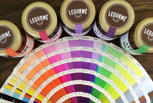
IndustriaHED created the glass jar labels for Legurmê's gourmet antipasti products using carefully selected colors from paint swatches. Each label was created using a paint swatch that suited its ingredients and markets the gourmet antipasti brand's products in a bold way.
The colors and typography play a vital role in the elegance of this packaging. In order to convey a strong and direct message, the lettering of the brand's name is hand-drawn on the front of each label while label colors are meant to mimic and represent the boldest flavors.
For example, the jar containing eggplant is represented with a dark purple label and playfully illustrated vegetables. These labels aim to appeal to a younger generation of food enthusiasts who appreciate the natural ingredients and playful color combinations adapted by this brand.
Key Themes Behind This Trend
- Color-inspired Packaging
- Using carefully selected colors from paint swatches to create visually appealing packaging for food products.
- Hand-drawn Typography
- Incorporating hand-drawn lettering to create a unique and bold brand identity.
- Playful and Vibrant Labels
- Using bold and vibrant colors to appeal to a younger generation of food enthusiasts.
Where This Applies
- Food Packaging
- Exploring innovative and visually appealing packaging designs for food products.
- Graphic Design
- Utilizing hand-drawn typography and playful color combinations in branding and packaging design.
- Food and Beverage
- Targeting younger food enthusiasts with visually appealing and vibrant packaging for gourmet food products.