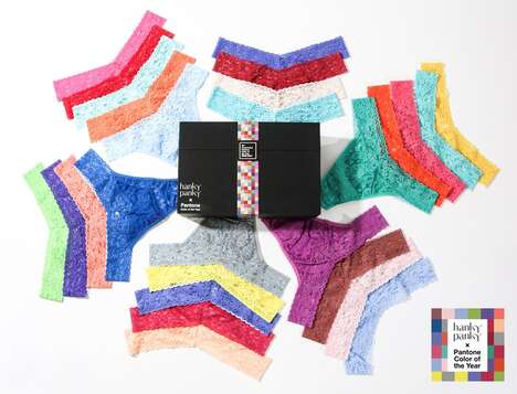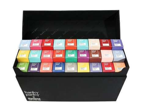

Pantone is a company in New Jersey known for its color-matching system and this condom branding is inspired by the company's swatches.
Pantone's color-matching system is comprehensive and includes thousands of different colors and shades. The condom branding concept was designed by the studio 'Dark Design Group' and comes in packs of three that each resemble the swatches that Pantone creates. Each individual color is representative of a flavor, which is also numbered and labeled underneath the branding -- just like Pantone's swatches are. The condom flavors and accompanying illustrations include bananas, mangoes, cherries, lemons, grapes and more that each appear to be wrapped in condoms.
This concept for condom packaging combines the design of a recognized brand and relates it to sexual health, ensuring that it is able to capture the interest of people who are sexually active.
Key Themes Behind This Trend
- Color-inspired Packaging
- The use of Pantone's color-matching system in condom branding showcases the trend of color-inspired packaging.
- Flavor-representative Branding
- The flavor-representative branding trend in condom packaging offers a unique and fun experience for consumers.
- Crossover Branding
- The combination of a recognized brand like Pantone with sexual health products represents the trend of crossover branding in the market.
Where This Applies
- Contraceptive Industry
- The contraceptive industry can explore the disruptive innovation opportunity of utilizing color-matching and flavor-representative branding in their packaging.
- Graphic Design Industry
- The graphic design industry can consider the disruptive innovation opportunity of incorporating recognizable brand elements, like Pantone swatches, into various product packaging designs, including condoms.
- Sexual Wellness Industry
- The sexual wellness industry can tap into the trend of crossover branding by partnering with influential brands and creating unique packaging concepts to increase customer engagement and interest.