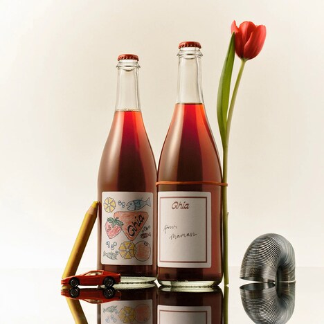
You might say that Cocktail Sodas packaging incorporates no pictures, but the brand image fosters visual interest thanks to a very artistic approach to presenting text. Student designer Miriam Altamira combined illustrations and alphabetic characters into one delightful display that causes the consumer's eyes to dance.
Reading the labels from left to right is a stimulating exercise because each letter has been made with a unique and elaborate look. The hand-drawn symbols pull from all sorts of different fonts for inspiration, as well as from the fruits that go into the flavorful drinks. Abstract patterns develop from the fleshy features of berries, lemons an grapefruits; meanwhile, wave-like motifs are made to represent the tonic water. Cocktail Sodas packaging comprises doodles directly on the clear bottles for a light and playful appearance.
Why This Trend Is Growing
- Hand-drawn Typography
- More brands can incorporate hand-drawn typography and illustrations to make their products visually interesting.
- Abstract Pattern Design
- Abstract pattern design using fruit and wave-like motifs can be used by designers for packaging and label designs.
- Doodle Art
- Doodle art can be used by designers to create fun and playful packaging designs for various consumer products.
Industries Being Reshaped
- Beverage Industry
- Beverage companies can use hand-drawn typographic illustrations and abstract patterns to differentiate their products on the shelf.
- Packaging Industry
- Packaging companies can offer doodle art and playful label design services to help brands differentiate their products with visually interesting designs.
- Design Industry
- Designers can use this trend of hand-drawn typography and abstract patterns to experiment with packaging and label designs for various consumer products.