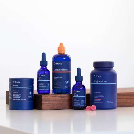
Clarity in product branding is something for which many consumer search, and this is what you get with Bioheal Vitamins packaging. The two-tone printing and basic geometries of the emblem on the label communicate a simplicity and purity about the ingredients that is valued by those who buy nutritional supplements.
Ronald Arokszallasi began with a pretty standard pill bottle to make the product immediately recognizable as one for the enhancement of health. Upon the white plastic, he applied labels that are color-blocked in either white, purple or gray. The different hue combinations distinguish the vitamin Cs from the Omega-3s; however, every piece of Bioheal Vitamins packaging features a honeycomb pattern that at once appears like a diagram of chemical bonds and a natural flower symbol.
What's Driving This Trend
- Minimalist Packaging
- Opportunity for creating clean, simple packaging designs that communicate purity and simplicity.
- Two-tone Printing
- Potential for using color-blocking techniques to distinguish different products and enhance brand recognition.
- Geometric Logos
- Chance to use basic geometries and patterns to create visually appealing and recognizable brand emblems.
Who This Affects Most
- Nutritional Supplements
- Potential for innovative packaging designs to enhance the visual appeal and perception of product purity in the nutritional supplement industry.
- Health and Wellness
- Opportunity to utilize minimalist packaging and geometric branding to differentiate and promote health and wellness products.
- Printing and Packaging
- Potential for incorporating two-tone printing techniques and geometric design elements in packaging across various industries, including food, beverages, cosmetics, and more.