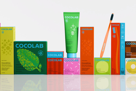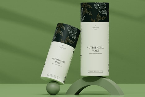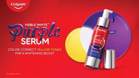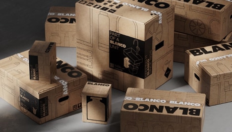
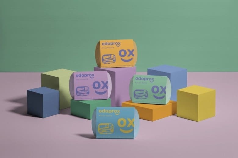
Odoprox relaunched its professional dental-care line with a full rebrand by Veralidad Studio, featuring a luminous, modular packaging system designed to replace the sector’s clinical look. The redesign introduced brighter flat colors, a friendlier logo with a playful XO and softer type, and packaging formats for toothpaste, toothbrushes, and dental mini-kits.
The project produced a coherent, scalable visual language that can extend across future products and touchpoints. Designs prioritize clarity and movement, integrating the new logotype into compositions and using minimalist structures to improve shelf distinction and usability in pharmacies and clinics.
For consumers and professionals, the refresh made dental care feel more approachable while preserving professionalism, encouraging healthy habits through clearer communication and brand recognition. The modular approach also streamlined rollout potential for new SKUs, reflecting a wider trend toward human-centered, system-driven healthcare branding.
Image Credit: Veralidad Studio
Key Themes Behind This Trend
- Human-centered Healthcare Branding
- A shift toward friendlier, less clinical visual identities that prioritize clarity and approachability could redefine patient engagement and trust across medical product categories.
- Modular Packaging Systems
- Interchangeable, scalable packaging architectures allow rapid SKU expansion and consistent brand expression that can streamline supply chains and reduce design overhead.
- Color-driven Shelf Differentiation
- Bold, flat color strategies that improve in-store visibility and category navigation present opportunities to increase impulse purchase rates and simplify consumer decision-making.
Where This Applies
- Dental Products
- The professional dental-care segment can leverage playful yet professional packaging to make clinical products more accessible and broaden consumer adoption of preventive routines.
- Pharmaceutical Retail
- Pharmacies and clinic dispensaries stand to benefit from modular, color-coded assortments that enhance shelf clarity and reduce stocking errors.
- Brand Design Agencies
- Creative firms focused on healthcare identity can capitalize on system-driven rebrands that balance regulatory constraints with human-centric aesthetics.