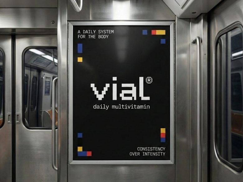
India-based design studio Presentable has developed vial, a multivitamin packaging and identity system built around a rational grid where geometric units represent individual nutrients. Rather than leaning on urgency or visual noise — common tactics in supplement branding — vial uses structure as its primary language. Units align, stack, and shift across packaging to express balance and nutritional variation, while the same grid logic extends to the logotype, creating a brand system that feels genuinely unified.
The result is packaging that doubles as a ritual object. Integrated checkboxes turn daily dosing into a tactile habit, and color functions as a navigational layer across SKUs without breaking the system's cohesion. On shelf, the repetition creates rhythm while controlled variation aids wayfinding — a rare balance in wellness retail, where visual clutter tends to dominate.
Why This Trend Is Growing
- Modular Packaging Systems
- A packaging approach built from interchangeable geometric units enabling personalized SKUs and on-shelf variability that reduces inventory complexity.
- Grid-based Brand Identities
- Structured visual systems that scale across touchpoints to maintain cohesion while enabling rapid SKU differentiation and consistent wayfinding.
- Ritualized Consumer Interactions
- Physical packaging elements that convert routines into tactile habits, fostering habitual use and stronger brand attachment.
Industries Being Reshaped
- Nutraceuticals
- Standardized modular units offer opportunities for bespoke supplement combinations and clearer regulatory labeling across diverse product lines.
- Retail Design
- Shelf-level rhythm and controlled visual variation create environments that improve navigation and perceived trustworthiness amid cluttered assortments.
- Consumer Health Tech
- Tactile dosing interfaces paired with digital tracking present possibilities for seamless integration of physical rituals and adherence data.