At one point in time, consumers preferred to see elaborate graphics on packaging; now, many are more than satisfied with the use of type-based branding. A more recent stylistic wave favors a stripping down of product labels, setting such minimalist items apart from the overstimulating bottles and cartons that are often otherwise displayed on shop shelves.
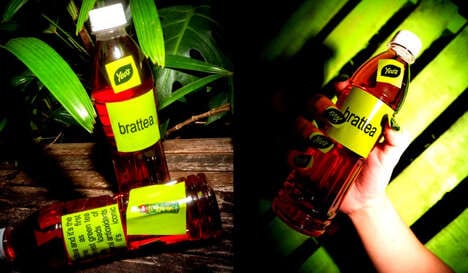
In this example, Venice Cold Brew features basic screen-printed lettering in a typeface that is both bold and lightweight at once. This particular font is sufficient in standing out without seeming to scream at the consumer in its all-caps format. It's quite a careful balance. An unusual short container and an honest transparent glass both further the unique impression that the type-based branding offers, framing iced coffee as a cool alternative to caffeinated soft drinks.
Key Themes Behind This Trend
- Minimalist Packaging
- Opportunity for brands to utilize simple and stripped-down labels to stand out amongst overstimulating product packaging.
- Typeface Branding
- Potential for brands to use bold and lightweight lettering to create a distinct and memorable visual identity.
- Transparent Packaging
- Opportunity for brands to showcase honesty and transparency through the use of clear glass containers and packaging materials.
Where This Applies
- Beverage Industry
- Disruptive innovation potential for beverage brands to differentiate themselves by adopting minimalist packaging and typeface branding.
- Food Packaging Industry
- Opportunity for companies in the food packaging industry to cater to the growing demand for transparent packaging solutions.
- Graphic Design Industry
- Opportunity for graphic design firms to specialize in developing distinct typeface brands and minimalist packaging designs for various businesses.