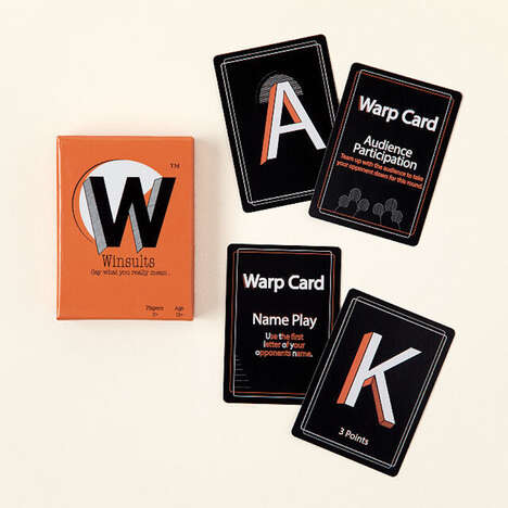

The all-ages wordplay game called 'Rackare' was given a delightful packing design created by Joakim Bergkvist for Ninja Print. The game itself is similar to 'Cards Against Humanities,' but this version is family-friendly and appropriate for all ages.
Keeping the target consumers in mind, the packaging design was able to use bright colors and playing styles. Using these themes, the designer opted for black, white and bright orange as the main colors.
The package features a face-mimicking design on the front using diagonal stripes and a bright orange smiling mouth. The name of the game is also printed on the front in bold legible writing, which is written on an angle. The mouth, which appears to be open makes a great logo for the game since the car game is all about wordplay.
Key Themes Behind This Trend
- Colorful Packaging Designs
- Packaging designs that appeal to the target consumers through bright colors and playful themes.
- Family-friendly Games
- The growing demand for games that can be enjoyed by both adults and children.
- Wordplay Games
- Games that test and build vocabulary and language skills.
Where This Applies
- Board and Card Game Industry
- The industry that produces games that are mostly played on a flat surface.
- Toy Industry
- The industry that produces playthings designed for children's entertainment.
- Graphic Design Industry
- The industry that provides visual and creative solutions for businesses to promote their products.