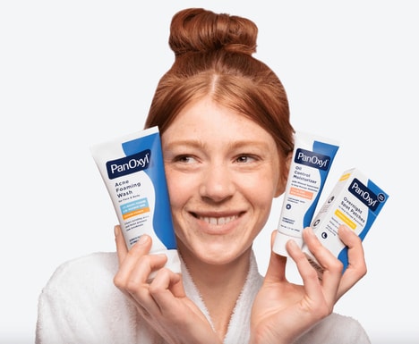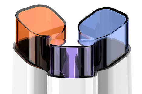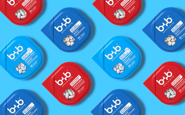

Designer Chuya Lee was enlisted to create the branding for the new medication brand B+B, and the goal of both the company and the designer was to create a collection of pain relief packaging that is able to stand out on shelves.
With Chuya Lee focusing on both both function and style, the packaging of the resulting products feature a rounded square shape in vibrant blue or red colors. Each package features a transparent panel through which the medicine it contains can be observed, and has minimal labeling that describes the fundamentals of the product.
To further motivate consumers to purchase these eye-catching pain relief products, the B+B brand has added a charitable element to any purchase -- with the brand donating a package for each one that is sold.
Key Themes Behind This Trend
- Eye-catching Packaging
- There is an opportunity for companies to create unique and visually appealing packaging that stands out on shelves.
- Transparent Panel Packaging
- Incorporating transparent panels in packaging allows consumers to easily see the product inside, providing a sense of transparency and trust.
- Charitable Incentives
- Adding a charitable element to product purchases can motivate consumers to choose a brand that supports a cause.
Where This Applies
- Pharmaceutical
- The pharmaceutical industry can explore innovative packaging solutions that enhance the appeal and functionality of pain relief products.
- Packaging
- The packaging industry has an opportunity to develop creative packaging designs that catch consumers' attention and improve product visibility.
- Consumer Goods
- Companies in the consumer goods industry can differentiate their products by incorporating charitable initiatives into their branding and packaging.