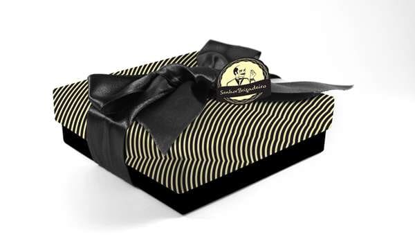
Classic negrinho chocolates have been given a fresh and contemporary image with the design of Mr. Brigadier packaging. Daniel Machado wished however to instill each box and jar with a subtle taste of the sweets' history through the conception of the retro logo and the mesmerizing color scheme.
Firstly, Senhor Brigadeiro himself was rendered in a simple two-tone illustration complete with a dinner jacket, a curling mustache and a monocle. The image is embraced with a spiraling frame employed as a medallion to label each chocolate wrapper.
When it comes to the aesthetic of Mr. Brigadier packaging, the color black was a deliberate decision, since the nickname of these confections literally means "blackie." Printed with fine curving stripes against yellow, this project succeeds to be low-cost, sophisticated and scrumptious.
What Makes This Trend Stand Out
- Retro Branding
- Opportunity for businesses to reintroduce classic branding elements with a modern twist.
- Nostalgic Packaging
- Potential to tap into consumer desire for products that evoke a sense of nostalgia.
- Low-cost Sophistication
- Disruptive innovation to create affordable yet high-quality packaging designs.
Sectors Adopting This
- Food Packaging
- Innovative packaging solutions for food products.
- Confectionery
- Opportunity to create unique and visually appealing packaging for confectionery products.
- Graphic Design
- Disruptive innovation in graphic design to create visually striking packaging.