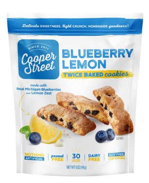
As much as consumers are concerned with the lifespan of a product as well as getting more bang for their buck, when it comes to food these days, options like Le Fruit are fast becoming the norm. Le Fruit focuses on a locally made, preservative free angle that health-conscious individuals will vastly appreciate.
The newly redesigned branding of Le Fruit embraces this angle. Through the use of a vibrant colors and icon system derived from the tropical fruits and plants of the Mekong Delta, design agency Rice Creative was able to allude to the story behind the Vietnamese brand. The finishing touch of Le Fruit's packaging design is the juicy hand-drawn script as its logo.
What Makes This Trend Stand Out
- Local, Natural and Preservative-free Food Products
- Innovative opportunity lies in creating more options for health-conscious consumers who prioritize locally made and preservative free foods.
- Vibrant and Tropical Packaging Design
- Disruptive innovation can come from incorporating bold and colorful packaging designs that reflect the ingredients and origins of the product.
- Hand-drawn Typography and Iconography
- Opportunities exist to use unique hand-drawn typography and iconography to create more memorable brand identities.
Sectors Adopting This
- Food and Beverage
- Food and beverage companies can incorporate the trend of local, natural and preservative-free food products to appeal to health-conscious consumers.
- Packaging and Graphic Design
- Graphic artists and packaging designers can embrace the trend of using vibrant and tropical designs, as well as hand-drawn typography and iconography, to enhance product branding.
- Marketing and Advertising
- Marketers and advertisers can tap into the trend of promoting local and sustainable food products to reach a wider audience of eco-conscious consumers.